Anatomy of a Shopify product page that converts.
Your product page does the selling. Here's how we lay out Shopify product pages — from gallery to reviews — to turn browsers into buyers.
In modern e-commerce, your homepage gets the applause, but your Product Detail Page (PDP) does the actual selling. With paid Meta, TikTok, and Google Shopping traffic routing prospective customers directly to specific product URLs, many of your shoppers will never see your homepage or read your about page.
For those visitors, your product page is your brand. If the page feels cluttered, lacks critical sizing details, hides shipping timelines, or buries social proof beneath the fold, shoppers won't explore further — they will tap the back button and buy from a competitor.
From our work on Shopify themes and stores — including our own Aveline theme — here's the layout we use for product pages that convert — and why each part is there.
1. Above the fold: visual clarity and immediate decision cues
The top 500 pixels of your product page on mobile determines whether a shopper stays or bounces. Every pixel must serve a purpose.
The sticky gallery and media mix
- High-resolution context imagery: Clean white-background packshots are table stakes, but lifestyle imagery showing the product in real environments (on diverse human models or in practical use cases) is what drives emotional connection.
- 10-second video loops: Incorporating short, silent, autoplaying video clips of the product moving, draping, or operating answers tactile questions that static photos cannot convey.
- Easy-to-browse thumbnails: On desktop, support smooth thumbnail scrolling; on mobile, provide an intuitive swipeable carousel with clear pagination dots so users know there are more photos to explore.
The primary decision block
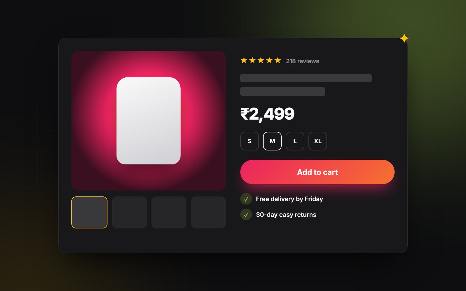
To the right of the gallery (or immediately below the mobile media carousel), arrange your purchasing block in this exact descending visual hierarchy:
- 1 Social proof micro-badge: Star rating summary with total review count (e.g., ★ 4.9 (428 reviews)) linked directly to the on-page review section.
- 2 Clear, unambiguous product title: Keep it concise and descriptive. Avoid internal warehouse codes or confusing SKU names.
- 3 Transparent pricing and payment installments: Display the current price prominently alongside compare-at pricing if on sale, paired with dynamic Shop Pay or Klarna installments (e.g., "or 4 interest-free payments of $24") to reduce sticker shock on higher-ticket items.
- 4 Visual variant selectors: Replace clunky dropdown menus with tactile visual swatches for colors and button pills for sizes. Clearly gray out out-of-stock variations to prevent checkout frustration.
2. Friction reducers directly beneath the "Add to Cart" button
The gap between the primary CTA and the bottom of the screen is where conversion anxiety peaks. Shoppers hesitate: When will this arrive? What if it doesn't fit? Are returns a hassle?
Defuse this anxiety right beneath the primary Add to Cart button with three essential trust signals:
- Dynamic shipping calculation: Instead of vague promises like "Fast shipping," display realistic date estimates (e.g., "Order in the next 3 hrs for delivery by Thursday, Oct 15").
- Risk-reversal return badge: Clearly display your return policy (e.g., "Free 30-day hassle-free returns & exchanges").
- Materials and origin badges: Reassure conscious consumers with clean icons (e.g., "100% Organic Cotton", "BPA-Free", or "Cruelty-Free").
3. Below the fold: answering objections with progressive disclosure
Once a shopper scrolls past the initial purchase block, they are looking for specific details to validate their purchasing impulse. Don't drown them in an unformatted wall of text.
Accordion drawers for technical details
Use expandable accordion sections for deep-dive product specifications:
- Materials & Care instructions: Exact fabric weights, washing recommendations, and material sourcing.
- Interactive size & fit guide: Comprehensive measurement charts accompanied by model stats (e.g., "Model is 5'10" wearing Size M").
- Shipping & International duties: Transparent breakdown of carrier rates, tracking timelines, and customs details.
The "Why It's Different" comparison module
A section that often works well is a simple side-by-side comparison: Your Product vs. The Generic Alternative. Highlighting 4 to 5 distinct advantages (e.g., double-stitched seams, sustainable packaging, proprietary ingredients) gives buyers the logical justification they need to complete their purchase.
4. Social proof with searchable, media-rich customer reviews
Star ratings without genuine customer context convince nobody. Modern shoppers look for social proof from people who look and live like them.
The elements of high-converting social proof
- Customer photo and video gallery: Allow buyers to filter reviews to see real, unedited photos submitted by verified purchasers.
- Customer attribute tags: Capture height, body type, typical size, or skin concern during the review submission so shoppers can filter reviews to match their exact profile.
- Verified buyer badges: Ensure reviews from verified purchasers are clearly flagged to build authentic trust.
A great product page doesn't pressure shoppers into buying — it systematically removes every logical and emotional hesitation that stands in the way of a confident decision.
5. The sticky mobile Add-to-Cart drawer
On mobile devices, product pages can be long (one more reason to design mobile-first). When a user scrolls down 1,500 pixels to read customer reviews, the primary "Add to Cart" button disappears off the screen. Forcing the user to manually scroll all the way back to the top of the page introduces friction.
Deploy a sticky bottom action bar that smoothly slides into view once the main buy button scrolls out of the viewport. It should feature a small product thumbnail, the current price, and a persistent "Add to Cart" button that opens an instant checkout slide-over drawer with one tap.
Want more sales from the traffic your Shopify store already gets? At Web Canvas, our E-commerce Optimisation service covers custom Shopify theme work and conversion audits. Let's analyze your product page metrics together.
Planning something similar?
Tell us what you're building and we'll come back with ideas and next steps.