Mobile-first design: what it really means for your website.
Mobile-first design is more than squeezing a desktop layout into one column. Here's what it means for hierarchy, tap targets, speed and conversions.
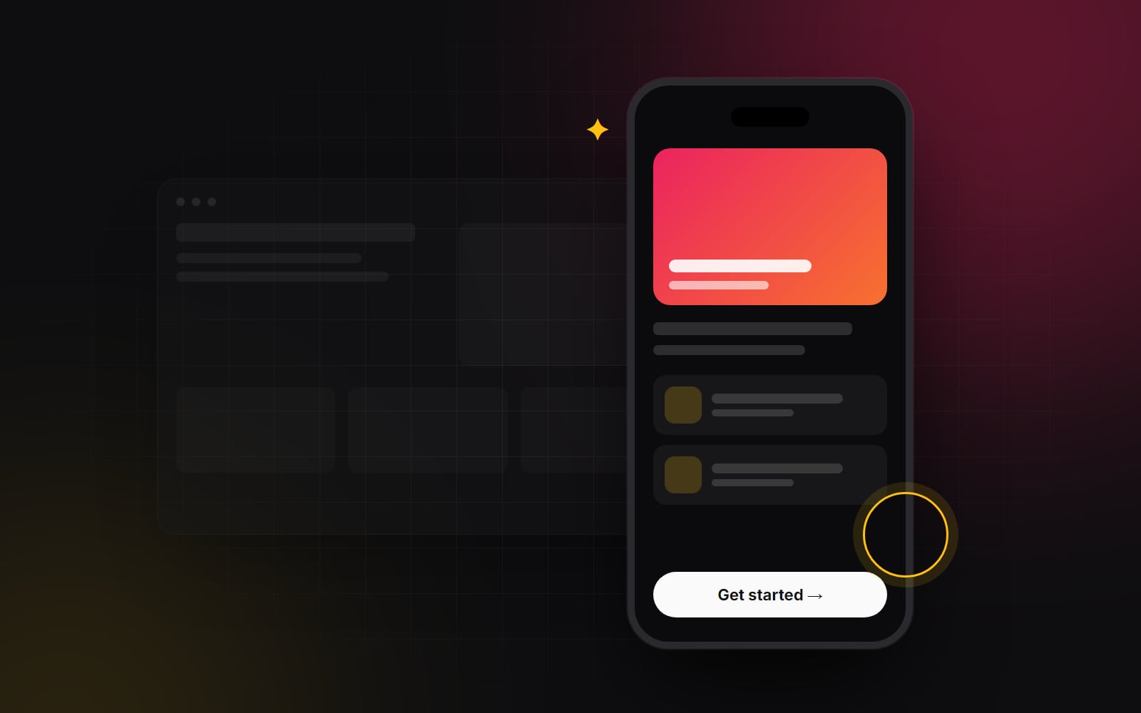
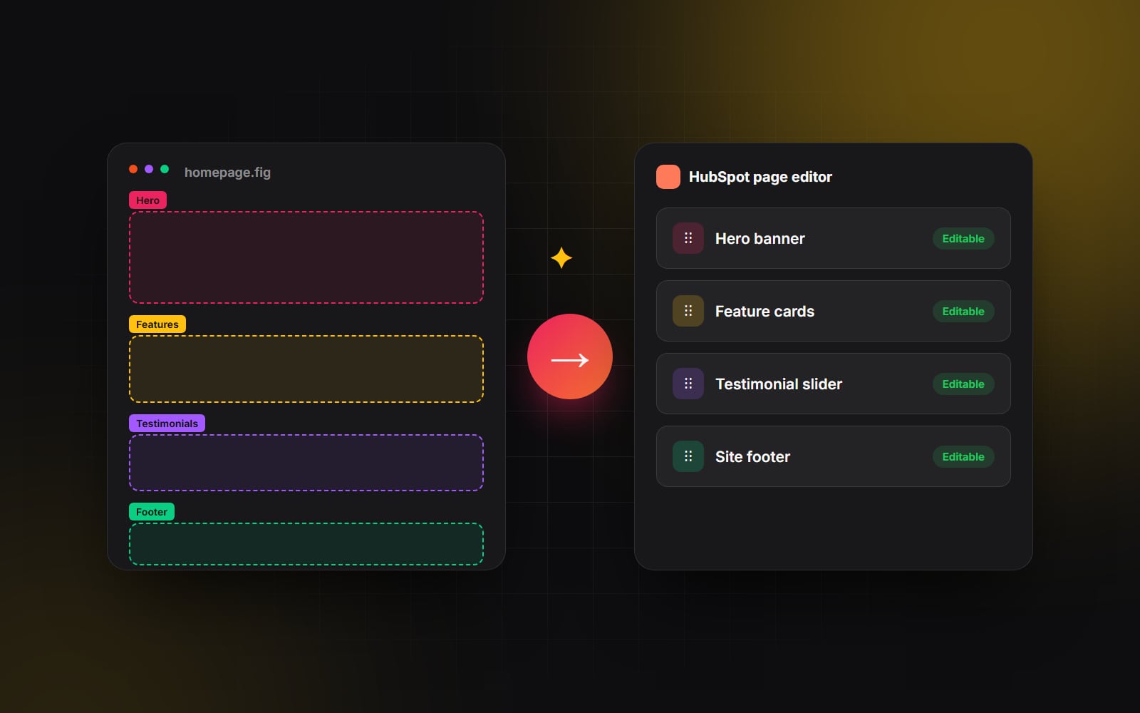
For more than a decade, the web design industry has preached the gospel of "mobile-first design." Yet if you sit inside almost any creative agency review today, you will witness the exact same workflow: the designer opens Figma, creates a massive 1440px desktop canvas, spends three weeks perfecting full-width horizontal grids and widescreen typography, and then hastily squeezes everything into a cramped 375px mobile frame on the final day before client handoff.
That is not mobile-first design — that is desktop-first design with a mobile compromise. And with around 60% of web traffic worldwide now arriving on phones — far more for many consumer brands — treating mobile as a secondary afterthought is a recipe for abysmal engagement and high bounce rates.
True mobile-first design is not a visual styling trick; it is an architectural discipline. Here is what genuine mobile-first design really looks like in practice, and why it consistently produces cleaner, faster, and higher-converting websites across every screen size.
1. The discipline of radical content prioritization
Desktop screens are dangerously forgiving. When you have 1,920 pixels of horizontal canvas, you can afford to be undisciplined. You can add decorative badge widgets, three supporting subheaders, floating illustration elements, and five secondary call-to-action buttons without feeling crowded.
On a mobile screen, physical real estate is scarce. You have roughly 390 by 844 pixels above the fold to capture someone's attention while they are commuting on a train, waiting in line for coffee, or multi-tasking between meetings.
What mobile-first forces you to answer
- What is the single most important message on this page? If a visitor only reads the first four inches of screen, what must they understand?
- What is the single primary action they should take? Not five competing buttons — what is the primary conversion step?
- What decorative clutter can be eliminated completely? If an image doesn't clarify the value proposition or build trust, it shouldn't take up 300 vertical pixels of mobile scroll depth.
When you solve the content hierarchy for a small screen first, you strip away fluff. When you later expand that layout to desktop, the clarity and punch of your messaging remains intact.
2. Designing for human thumbs, not mouse cursors
A desktop mouse cursor is an ultra-precise tool with a 1-pixel tip. A human thumb is an imprecise, soft appendage with a contact area of roughly 10 millimeters. Designing for mobile requires designing for human ergonomics.
Key touch-target fundamentals
- Comfortable touch targets: Apple's Human Interface Guidelines recommend at least 44×44 points and Google's Material Design 48×48 dp; WCAG 2.2 sets a minimum of 24×24 CSS pixels. Links and buttons placed too close together lead to "rage clicks" where users accidentally tap the wrong navigation element.
- Respect the thumb zone: Most users hold their smartphone with one hand, using their thumb to navigate. The bottom-third of the screen is the easiest area to reach comfortably. Critical interactive elements — sticky booking bars, filter triggers, and navigation drawers — should be anchored near the bottom of the viewport rather than tucked in the hard-to-reach top-left corner.
- Generous form input spacing: Form fields should feature at least 16px font sizes on mobile to prevent iOS Safari from triggering disruptive auto-zoom behavior on tap.
3. Mobile performance is conversion performance
On a desktop computer connected to high-speed home fiber, a 15MB website with heavy unoptimized video backgrounds might load in under two seconds. But on a mobile device connected to spotty 4G coverage at an airport terminal, that same website will grind to a halt.
Every additional megabyte of asset payload on mobile directly degrades your business metrics:
- 1 Bandwidth throttling: Mobile cellular networks have significantly higher latency and packet loss than fixed broadband. Delivering lightweight assets is essential.
- 2 Mobile CPU bottlenecks: Modern smartphones have powerful processors, but executing megabytes of JavaScript still slows down scrolling and taps on mid-range phones, and drains the battery.
-
3
Adaptive media delivery: Never serve a 2,560px desktop hero image to a 390px mobile screen. Use responsive
<picture>elements and modernsrcsetattributes to serve appropriately scaled, highly compressed WebP or AVIF assets. (More in Core Web Vitals in plain English.)
4. Rethinking complex desktop UI patterns for mobile
Certain desktop UI conventions simply do not work on a smartphone. A true mobile-first designer adapts interactions thoughtfully:
- Wide data tables: Trying to squeeze a 6-column pricing table onto a phone results in microscopic unreadable text. Convert the table into stacked, swipeable cards or an interactive toggle selector.
- Hover states: There is no hover state on a touchscreen. Never hide critical information, pricing details, or secondary navigation inside hover tooltips. All interactive states must be accessible via direct tap.
- Mega-menus: Complex multi-column desktop dropdowns must be re-architected into clean, hierarchical slide-out drawers with clear back-buttons and prominent search inputs.
Mobile-first is not about designing for less. It is about designing with greater focus, respecting real-world human behavior, and eliminating friction at every step.
The takeaway: why mobile-first wins
When you design mobile-first, you build a website that is fast, focused, accessible, and intuitive where the majority of your audience actually experiences it. Scaling a focused mobile design up to an expansive desktop monitor is a joy; cramming an unfocused desktop site onto a smartphone is a continuous compromise.
At Web Canvas, every interface we design begins with small-screen ergonomics and performance at its foundation. If your current website feels clunky or difficult to navigate on mobile, let's take a look together and build a truly responsive experience your users will love.
Planning something similar?
Tell us what you're building and we'll come back with ideas and next steps.