✦ Blog
Design articles.
Ideas on UI/UX, brand and web design: how to plan a website that is clear, accessible and built to convert, from the first brief to the finished pages.
 Design
· 6 min read
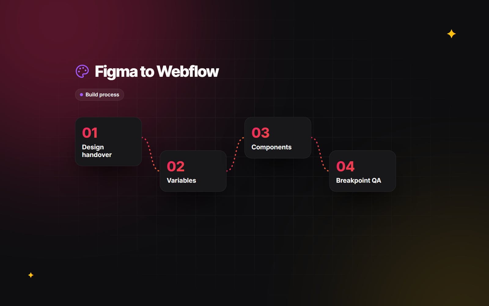
Figma to Webflow: how a developer builds your design
How a Figma design becomes a Webflow site: handover, styles and variables, components, responsive breakpoints and QA.
Read article →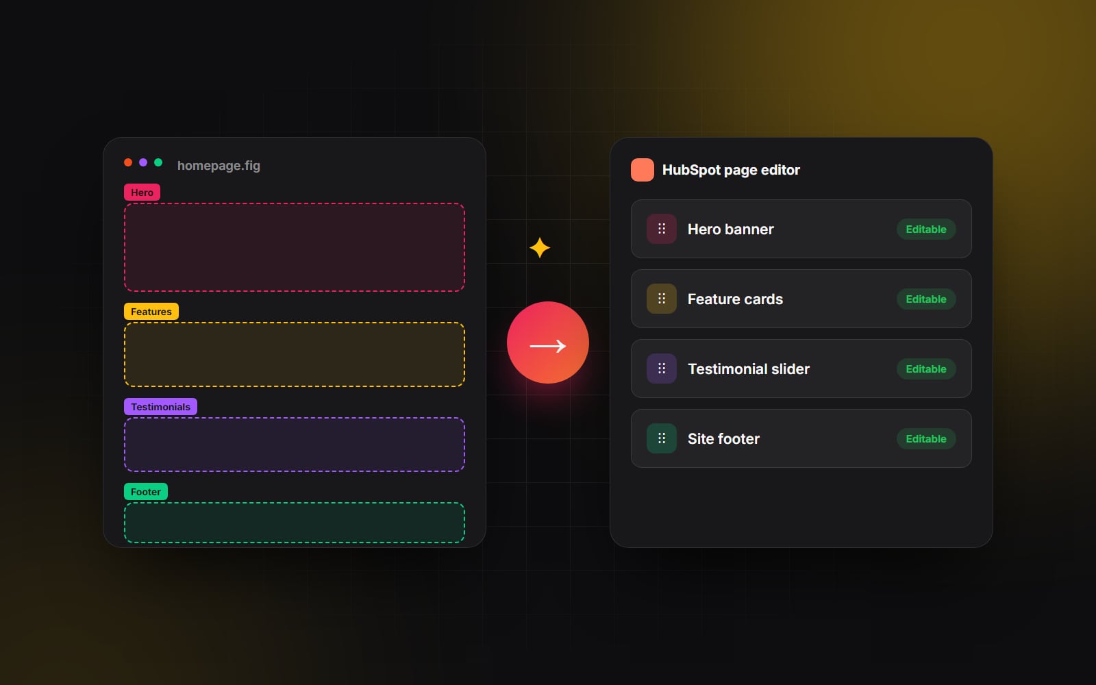 Design
· 5 min read
Figma to HubSpot: designing without platform limits
Designers are often told “HubSpot can't build that layout.” With custom modules and the HubSpot CLI, it almost always can — here's how we keep designs intact.
Read article →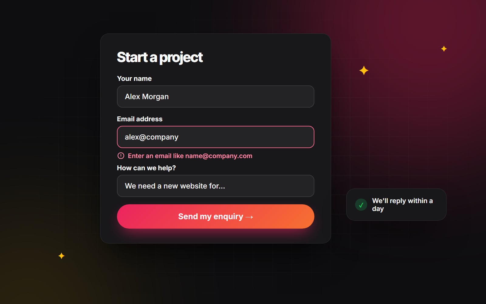 Design
· 4 min read
Form design that people actually finish
Forms are where visitors become leads, and where many give up. Practical design rules for contact, quote and checkout forms that people complete.
Read article →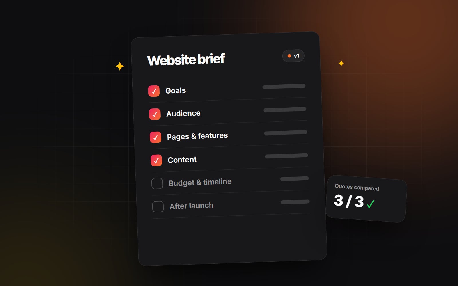 Design
· 4 min read
How to write a website brief that gets you accurate quotes
Vague briefs get vague, inflated quotes. Here's what to include so agencies can quote accurately and you can compare proposals like for like.
Read article → Design
· 4 min read
Mobile-first design: what it really means for your website
Mobile-first design is more than squeezing a desktop layout into one column. Here's what it means for hierarchy, tap targets, speed and conversions.
Read article →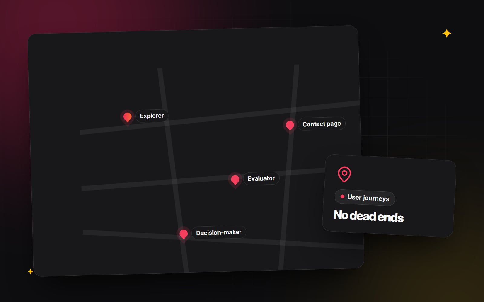 Design
· 5 min read
User journey mapping for service websites: fixing dead ends
Plan for the different visitors to a service website, give every page a next step and use GA4 explorations to see where people stop.
Read article →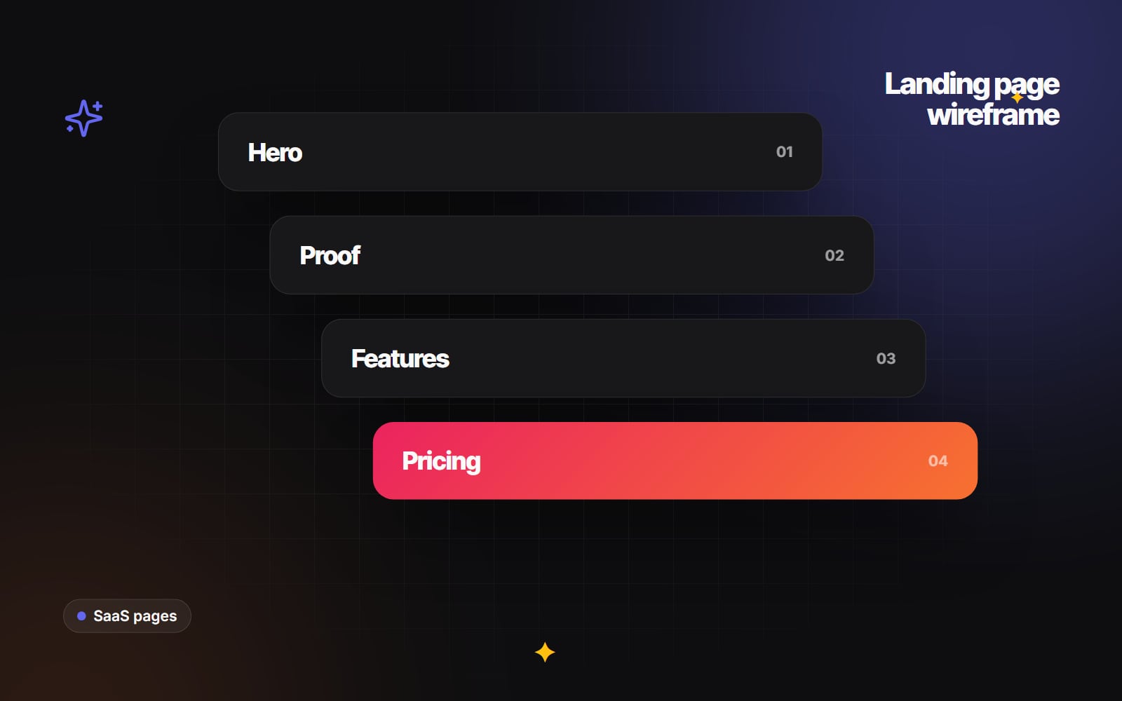 Design
· 5 min read
How to wireframe a SaaS landing page: hero, proof and pricing
A section-by-section structure for B2B SaaS landing pages: a clear hero, honest proof, problem-led features, pricing and an FAQ.
Read article →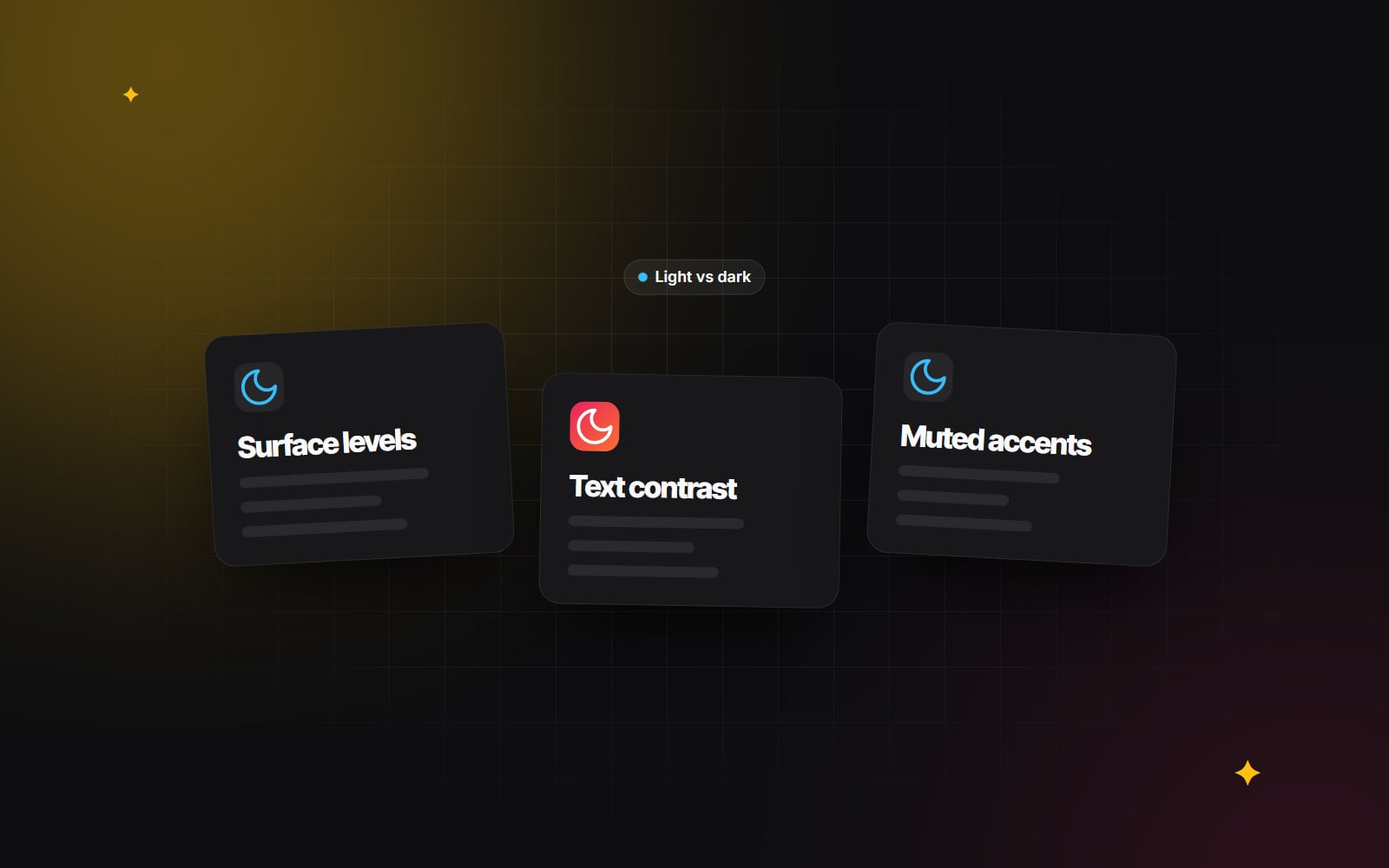 Design
· 5 min read
Dark mode done right: contrast, colour and brand consistency
Choosing dark surfaces and text colours that pass WCAG, showing elevation without shadows, adapting brand colours and avoiding theme flashes.
Read article → Design
· 5 min read
Micro-interactions: the difference between polish and gimmick
Where small feedback animations genuinely help users, how to build them accessibly, and how to keep them from slowing your site down.
Read article →