Micro-interactions: the difference between polish and gimmick.
Where small feedback animations genuinely help users, how to build them accessibly, and how to keep them from slowing your site down.
Physical controls give feedback without you thinking about it: a light switch clicks, a key travels and stops. On the web, that feedback has to be designed. When someone presses "Send enquiry" and nothing visibly changes, they start to wonder. Did it work? Should they press it again? Will they be charged twice?
Micro-interactions are the small, single-purpose responses that answer those questions: a button that shows it's working, a field that confirms a valid entry, a counter that ticks up when something is added to the basket. Done well, they remove doubt at the moments where people hesitate. Done badly, they are decoration that slows the page down and distracts.
The four parts of a micro-interaction
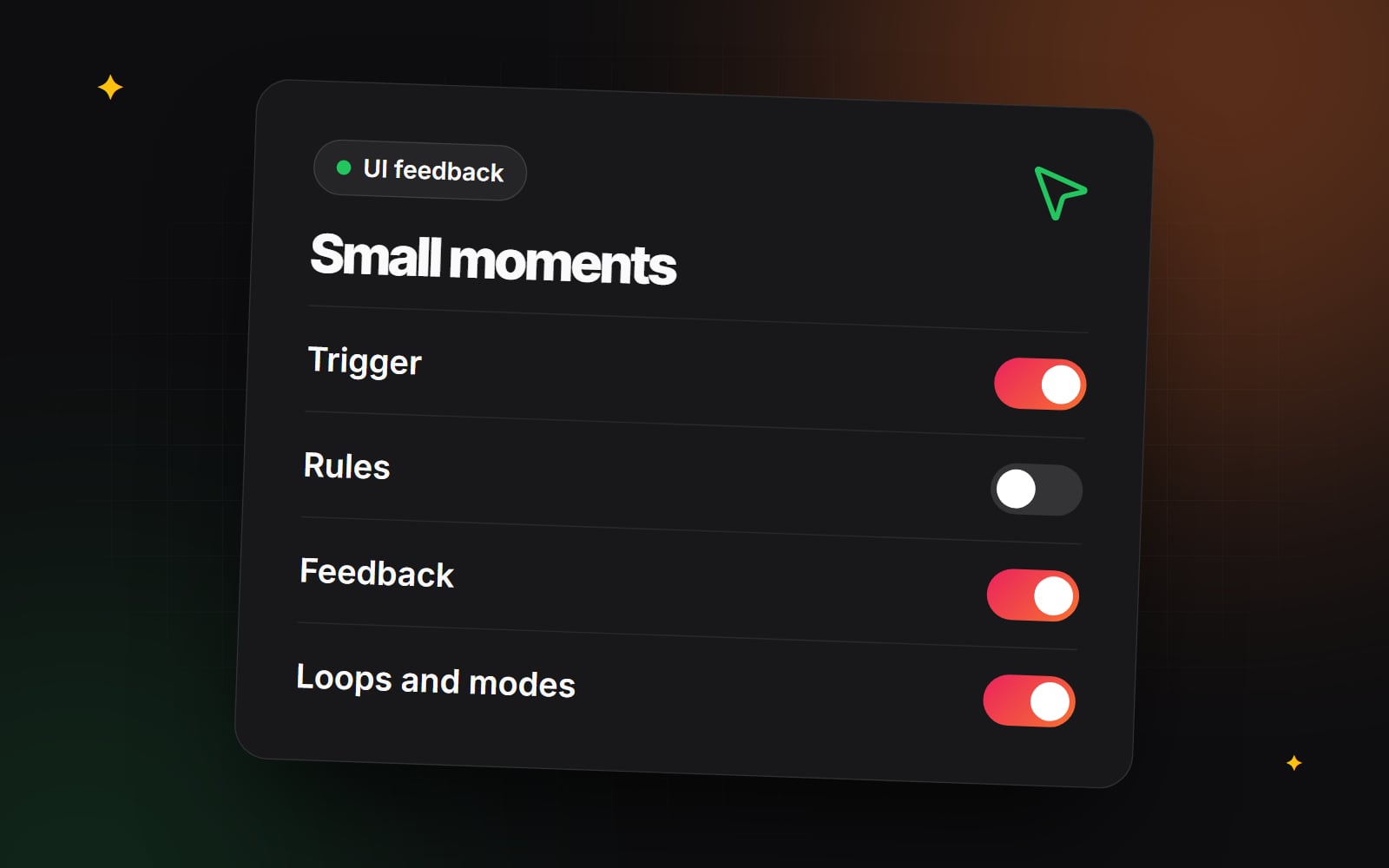
Designer Dan Saffer's book Microinteractions breaks each one into four parts. It's a useful checklist when you're specifying them.
1. Trigger
What starts it. Triggers can come from the user (clicking a button, opening an accordion, swiping a carousel) or from the system (a new chat message, a stock warning, a validation error).
2. Rules
What happens next, and in what order. For an "Add to basket" button the rules might be: prevent a second click, send the request, update the basket count, then show confirmation.
3. Feedback
What the user sees, hears or feels in response: a state change on the button, a short message, an updated count.
4. Loops and modes
How long it lasts and whether it repeats. Does the confirmation stay for a couple of seconds and then revert? Does a badge stay visible until dismissed?
Five micro-interactions worth getting right
Put your effort into the moments where people commit to something, not into scroll effects. These five come up on almost every commercial site.
1. Inline form validation
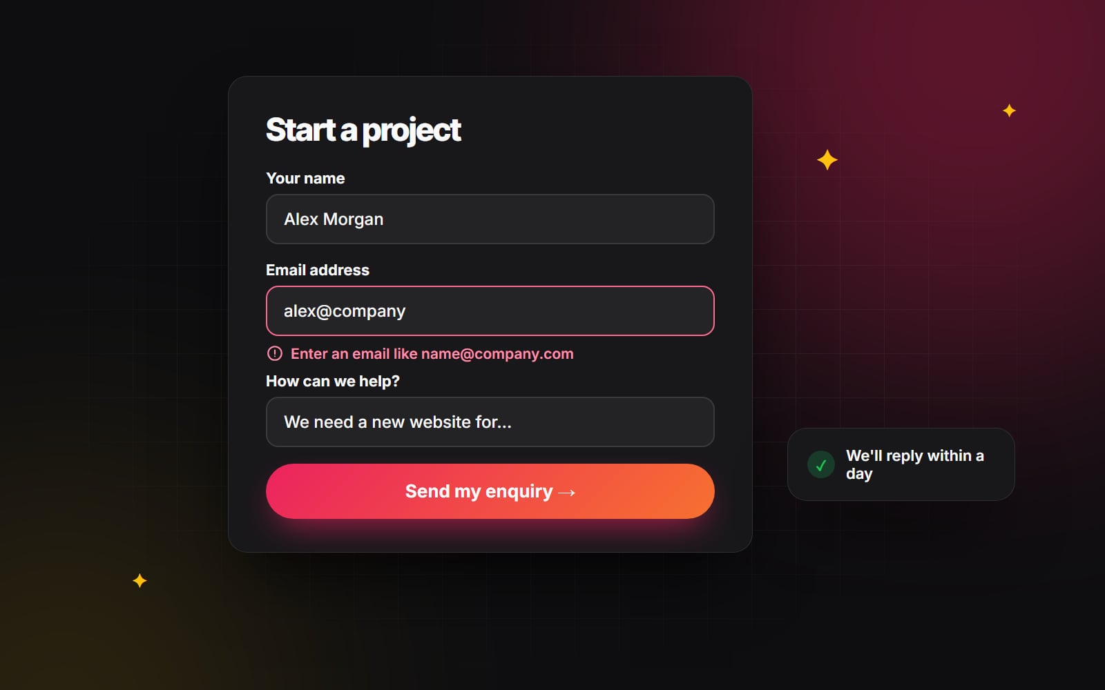
Few things are more discouraging than filling in a long form, pressing submit and getting a list of errors at the top of the page. Validate as people go, but at the right moment:
- Check a field when the user leaves it, not on every keystroke, so they aren't told an email address is invalid while they're still typing it.
- Show the error message directly below the field, in plain words that explain how to fix it.
-
Don't rely on colour alone. Pair a red border with an icon and text, and link the message to the field with
aria-describedbyso screen readers read it out.
Our guide to form design people actually finish covers labels, field order and error messages in more depth.
2. Add-to-basket feedback
Customers shouldn't have to scroll up to check whether an item was added. A clear sequence looks like this:
-
1
On press, give immediate visual feedback, such as a slight press effect (
transform: scale(0.97)). - 2 Disable the button and show a small loading indicator inside it while the request is in progress.
- 3 When the server confirms, change the label to "Added" and update the basket count in the header.
- 4 Announce the change to assistive technology with a polite live region, for example "Item added to basket".
- 5 After a short pause, return the button to its normal state so the customer can add another.
If the request fails, say so clearly next to the button and leave it enabled. On Shopify stores this usually lives in the theme's product form; see our notes on a Shopify product page that works for the surrounding layout, and our Shopify conversion work if you want help implementing it.
3. Skeleton screens for loading content
For content that takes a moment to arrive (search results, account dashboards, filtered product grids), a skeleton screen shows grey placeholder shapes in the layout of the content that's coming. Compared with a generic spinner, it tells people what to expect and where.
The performance benefit depends on getting the size right. A skeleton that reserves exactly the space the real content will take prevents the page from jumping when it loads, which helps your Cumulative Layout Shift score (Google's "good" threshold is 0.1 or less). A skeleton that's a different size from the real content still causes a shift. Skeletons don't make content load faster, so they're not a substitute for fixing slow responses; our explainer on Core Web Vitals covers what does.
4. Copy-to-clipboard confirmation
For discount codes, referral links or API keys, a copy button saves people from fiddly text selection on mobile. Swap the icon to a tick and show a short "Copied" message, then revert after a moment. Use a live region so screen reader users get the same confirmation.
5. Accordion and filter states
On FAQ sections and product filters, make open and closed states obvious. Rotating a chevron is a common pattern; more importantly, set aria-expanded on the trigger so assistive technology knows the state too. A short transition helps people see what opened without making them wait.
Performance and accessibility guardrails
A juddering animation is worse than none. Keep motion smooth and inclusive:
-
Prefer
transformandopacity. Browsers can usually animate these without recalculating layout. Animatingwidth,height,topormarginforces layout work on every frame and is much more likely to stutter, especially on low-end phones. - Keep functional animations short. Feedback on a button or toggle should feel immediate. Many design systems use durations of a few hundred milliseconds or less for this kind of motion. Test on a real mid-range phone rather than judging on a fast laptop.
-
Respect reduced motion. Some people set their device to reduce motion because animation can make them feel unwell. Honour that with the
prefers-reduced-motionmedia query. - Announce status changes. Visual feedback isn't enough on its own. WCAG 2.2 expects status messages (such as "Added to basket") to be available to assistive technology without moving focus, which is what a live region does.
- Don't block the user. Never make someone wait for an animation to finish before they can carry on.
A simple reduced-motion rule looks like this:
@media (prefers-reduced-motion: reduce) {
  *, *::before, *::after {
    animation-duration: 0.01ms !important;
    animation-iteration-count: 1 !important;
    transition-duration: 0.01ms !important;
    scroll-behavior: auto !important;
  }
}
This is a blunt but effective baseline; you can then reintroduce gentle, non-moving feedback such as colour or opacity changes where they help. Our accessibility basics cover the other essentials.
Polish or gimmick? A quick test
Before adding a micro-interaction, ask:
- Does it answer a question the user has at that moment ("did that work?", "what's loading?", "is this open?")?
- Would the interface be less clear without it?
- Does it still make sense with reduced motion turned on and with a screen reader?
- Does it add noticeable weight or delay to the page?
If the honest answer to the first two is no, leave it out.
We design and build these details as part of our UI/UX design work. If you'd like a review of the key interactions on your site, get in touch.
Planning something similar?
Tell us what you're building and we'll come back with ideas and next steps.