Website accessibility basics every business should get right.
Accessibility isn't just about compliance — it's good design and good business. Here are the WCAG 2.2 AA basics every website should get right.
For many business owners, "website accessibility" is a topic that only enters the conversation after someone receives an intimidating legal demand letter or reads a cautionary tale about digital compliance lawsuits. In the United States, website lawsuits citing the Americans with Disabilities Act (ADA) remain common, and in the EU the European Accessibility Act (EAA) has applied to many digital products and services since June 2025.
In response, many businesses install cheap "accessibility overlay" widgets — those little floating stick-figure badges that promise instant, one-click legal compliance with AI. But here is the hard truth: accessibility overlay widgets do not make your website accessible, and they do not protect you from legal liability. In fact, disability advocacy groups and screen-reader users actively condemn overlay widgets because they frequently interfere with native assistive technologies.
True web accessibility (WCAG 2.2 Level AA) cannot be painted on with a third-party JavaScript widget. It must be built into the semantic structure, typography, contrast ratios, and keyboard navigation of your website from the very first day. Here are the foundational accessibility basics every modern business must get right.
1. Color contrast: readable text for every set of eyes
One of the most widespread design trends of the past decade has been low-contrast typography: pale gray text on white backgrounds or subtle dark gray captions on black cards. While low contrast might look sleek on an expensive color-calibrated studio monitor in a dark room, it is virtually unreadable for millions of real-world users.
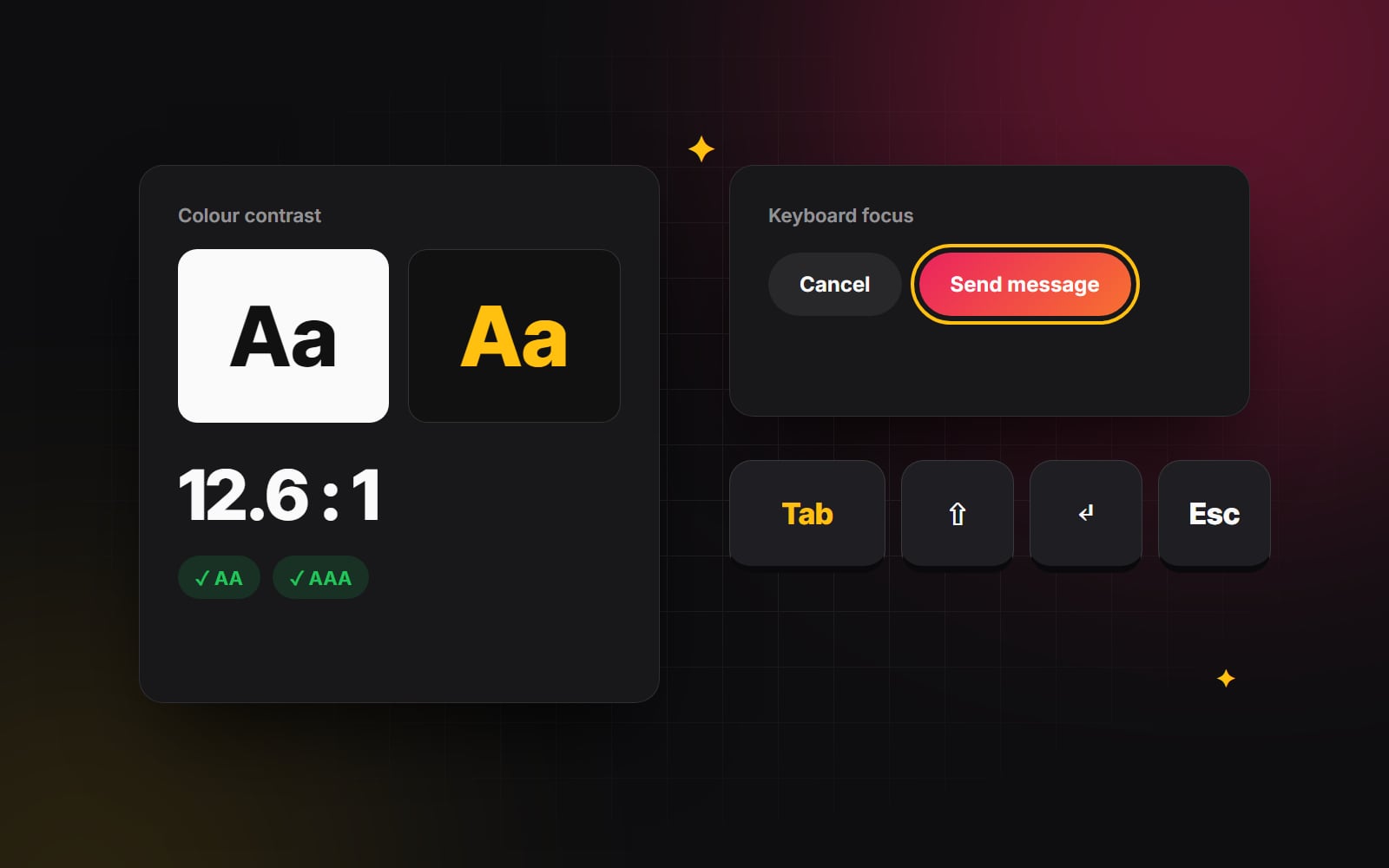
The Web Content Accessibility Guidelines (WCAG 2.2 AA) set clear contrast ratios:
- Regular body text (under 18pt/24px): Must have a contrast ratio of at least 4.5:1 against its background color.
- Large text (18pt/24px or bold 14pt/19px): Must have a contrast ratio of at least 3:1.
- Interactive UI elements and button borders: Must maintain a 3:1 contrast ratio against adjacent background colors so users can identify where clickable areas begin and end.
Designing for contrast doesn't mean your site has to look boring. It simply means choosing curated, harmonious color palettes where readability is never sacrificed for aesthetic minimalism.
2. Meaningful alternative text for imagery
Visually impaired users rely on screen readers (such as VoiceOver on Apple devices or NVDA on Windows) to convert digital layouts into synthesized speech or braille displays. When a screen reader encounters an image, it reads the image's alt attribute.
How to write proper alt text
- Describe the functional meaning, not just visual decoration: If an image shows a chart comparing pricing tiers, write: "Comparison chart showing Pro plan includes 5 team seats versus 1 on Basic" rather than "chart image".
- Avoid repetitive phrasing: Screen readers already announce that an element is an image. Never start alt text with "Image of..." or "Photo showing...".
-
Mark purely decorative graphics as empty: If an icon, decorative gradient, or background curve adds zero substantive information to the page, set its attribute to
alt=""or addaria-hidden="true"so screen readers ignore it smoothly.
3. Flawless keyboard accessibility and visible focus states
Not everyone navigates the web using a mouse or trackpad. Users with motor disabilities, tremors, or repetitive strain injuries navigate websites exclusively using their keyboard — pressing the Tab key to jump forward through interactive elements, Shift+Tab to jump backward, and Enter/Space to activate buttons and links.
Keyboard fundamentals to audit immediately
-
1
Never remove the CSS focus ring without replacement: The most destructive CSS rule on the internet is
outline: none;. When developers remove focus outlines without providing a custom visual focus state, keyboard users become completely blind to where their cursor is on the screen. Always provide an unmistakable visual outline or highlight when an element receives focus. -
2
Logical tab order: The keyboard navigation order must mirror the visual reading order of the page (top-to-bottom, left-to-right). Avoid CSS such as
flex-direction: row-reverseororderthat rearranges the visual order, which makes the focus indicator jump erratically across the screen. - 3 Accessible modal and drawer focus traps: When a user opens a mobile menu, cookie banner, or pop-up modal, keyboard focus must be trapped inside that modal until closed. When closed, focus should gracefully return to the button that triggered it.
4. Semantic HTML: clean architecture under the hood
Modern frontend frameworks make it easy to build entire websites out of generic <div> and <span> tags styled with CSS. But to an assistive technology, a clickable <div> with an onClick handler is completely invisible as an interactive button.
Always use native HTML semantic elements:
-
Use
<button>for interactive actions (opening modals, toggling accordions, submitting filters). -
Use
<a href="...">for navigation between pages. -
Use semantic landmarks:
<header>,<nav>,<main>,<article>,<aside>, and<footer>so screen reader users can jump directly to specific page sections without listening to repetitive header menus. -
Ensure every form input has an associated, explicitly linked
<label for="...">tag so users understand what information is required.
Accessible design is not a constraint on creativity. It is simply good design that respects every human being who visits your website.
The takeaway: accessibility is good business
According to the World Health Organization, about 16% of people worldwide live with a significant disability, whether visual, auditory, motor, or cognitive. Making your website accessible is not just about avoiding legal risk — it is about expanding your addressable market, improving SEO, boosting usability for older audiences and mobile users, and treating every prospective client with dignity.
At Web Canvas, WCAG 2.2 accessibility standards are built into our design systems, component libraries, and frontend codebases as an uncompromised standard. If you want an accessibility audit of your current website, get in touch with our team today.
Planning something similar?
Tell us what you're building and we'll come back with ideas and next steps.