Form design that people actually finish.
Forms are where visitors become leads, and where many give up. Practical design rules for contact, quote and checkout forms that people complete.
Your website can do everything right, from search rankings to design to copy, and still lose people at the last step. Forms are where visitors turn into enquiries, bookings and customers, and they're also where many quietly give up.
Most form problems are small: a confusing label, an unnecessary question, an error message that doesn't say what's wrong. Fix enough of them and more people finish. These are the rules we follow when we design contact, quote and checkout forms.
1. Ask only what you need
Every field is another reason to stop. For each one, ask: what will we do with this answer, and do we need it now? A contact form often needs only a name, an email address and a message. Details such as company size or budget can come later in the conversation, or be optional.
Collecting less also makes privacy simpler. Data minimisation, collecting only what you need for a stated purpose, is one of the principles of data protection laws such as the GDPR.
2. Use clear labels, above the field
- Put a visible label above every field. Placeholder text inside the box disappears as soon as someone starts typing, so it shouldn't be the only label.
- Use plain words: "Your email address" rather than "Contact identifier".
- Mark optional fields as "(optional)", rather than marking every required field with an asterisk. Most fields should be required anyway, or they shouldn't be there.
- Add hints where people might hesitate, such as "We'll only use this to reply to you" under a phone field.
3. Keep it in one column
People read a form from top to bottom. Fields placed side by side are easy to miss and awkward on a phone. Group related fields under short headings for longer forms, and keep pairs such as first and last name together only where it's obvious.
4. Help phones and browsers fill it in
Small technical details make a big difference on mobile:
-
Use the right input types, such as
type="email"andtype="tel", so phones show the right keyboard. -
Add autocomplete attributes, such as
autocomplete="name","email","tel"and"postal-code", so browsers can fill in saved details. - Make tap targets large enough and well spaced. WCAG 2.2 sets a minimum target size, and most good designs go well beyond it.
Our article on mobile-first web design explains why designing for phones first leads to better forms everywhere.
5. Write error messages that fix things
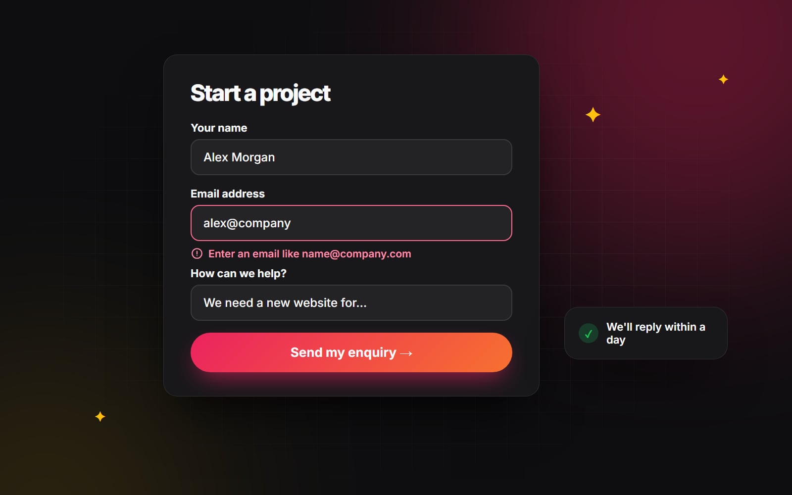
"Invalid input" tells people nothing. A good error message says what's wrong and how to fix it, right next to the field:
- "Enter an email address like name@company.com"
- "Phone numbers can only contain digits and spaces"
Check each field when the person moves on to the next one, not after every keystroke. Never clear what they've already typed when there's an error, and when the form is submitted with mistakes, move focus to the first problem so keyboard and screen reader users can find it. Our guide to accessibility basics covers more of this.
6. Choose spam protection that people don't notice
Puzzles and distorted text frustrate real people and can be a barrier for disabled users. WCAG 2.2 includes a requirement about not relying on memory or puzzle tests to log in, and the same thinking applies to forms. Start with methods visitors never see:
- A hidden "honeypot" field that people never fill in but bots do.
- Limits on how many submissions can come from one source in a short time.
- Invisible checks such as Cloudflare Turnstile or reCAPTCHA v3, which only challenge visitors when something looks suspicious.
7. Split long forms into steps
Quote requests, applications and checkouts sometimes need more information. Splitting them into short steps, each with a clear heading, makes them feel more manageable than one long page:
- Show progress, such as "Step 2 of 3", so people know how much is left.
- Start with the easiest questions. Once people have begun, they're more likely to finish.
- Let people go back without losing what they entered, and don't ask for the same information twice. WCAG 2.2 includes a requirement about this too.
- Save progress where you can, so an interruption doesn't mean starting again.
8. Make the button say what happens
"Submit" is a word about the form. "Send my enquiry", "Get my quote" or "Book a call" describe what the person gets. Put the button directly under the last field, make it the most visible thing on the form, and show that it's working once clicked so nobody presses it twice.
9. Confirm and set expectations
After sending, people want to know it worked and what happens next. A good confirmation message says:
- That the message was received.
- Who will reply, and roughly when.
- What they can do in the meantime, such as read a related guide or see your work.
Sending a short confirmation email with a copy of their message is a helpful extra. If your forms feed a CRM, our article on HubSpot automations shows how to follow up automatically and quickly.
Review your own forms in 15 minutes
- 1 Open your contact form on your phone, not your computer.
- 2 Fill it in with real details, using autofill where it's offered.
- 3 Submit it once with a deliberate mistake, such as an email address without the @, and read the error message.
- 4 Submit it properly, and check what you see afterwards and whether the confirmation email arrives.
- 5 Check the enquiry reached the right inbox or CRM.
- 6 List every moment you hesitated. Each one is something to fix.
Good forms come from good UX design. If you'd like us to review your forms or your whole enquiry journey, use ours. We've tried to follow every rule on this page.
Planning something similar?
Tell us what you're building and we'll come back with ideas and next steps.