Figma to Webflow: how a developer builds your design.
How a Figma design becomes a Webflow site: handover, styles and variables, components, responsive breakpoints and QA.
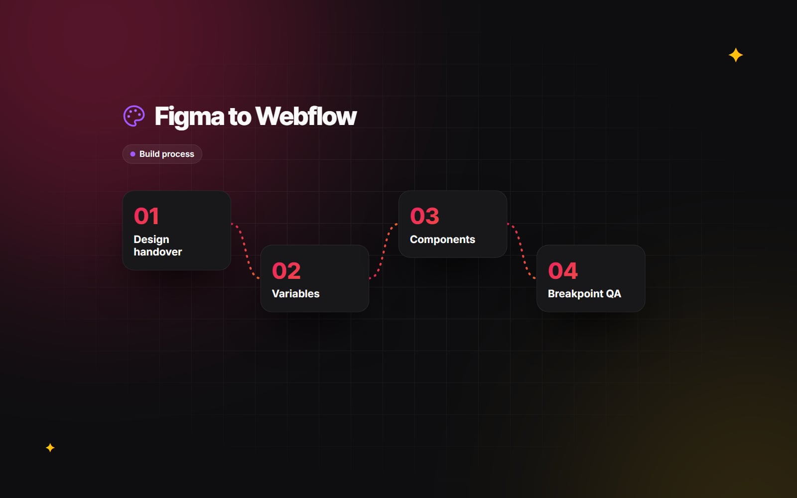
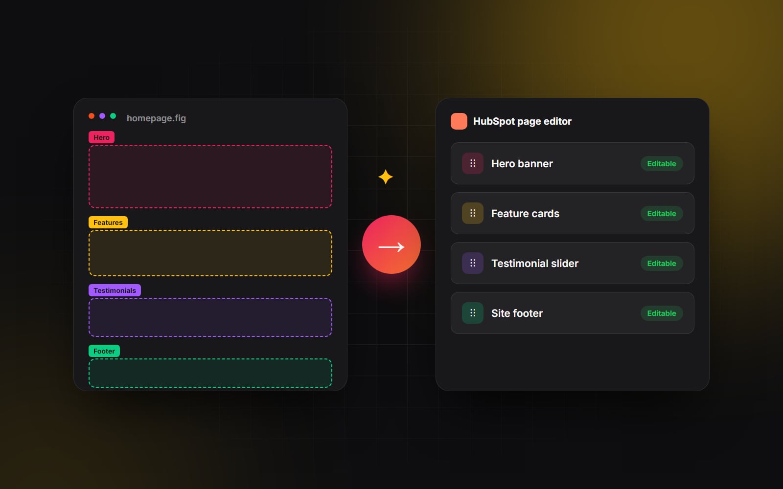
Turning a Figma design into a Webflow site is not a one-click export. A Webflow developer rebuilds the design inside Webflow using styles, variables, components and CMS templates, so that the result is responsive, editable and fast. Knowing how that Figma to Webflow process works helps you prepare a better handover, avoid surprises and judge whether the finished build is solid.
Why the design has to be rebuilt, not exported
Figma draws frames on a fixed canvas. A website has to reflow across every screen width, load quickly, work with a keyboard and screen reader, and let editors change content without breaking layouts. Webflow's official Figma plugin can bring some components, styles and variables across, which saves time on the foundations, but layout, responsive behaviour, CMS bindings and interactions still need a developer's judgement. Think of the design as a precise specification rather than something that can be converted directly.
Step 1: preparing the design handover
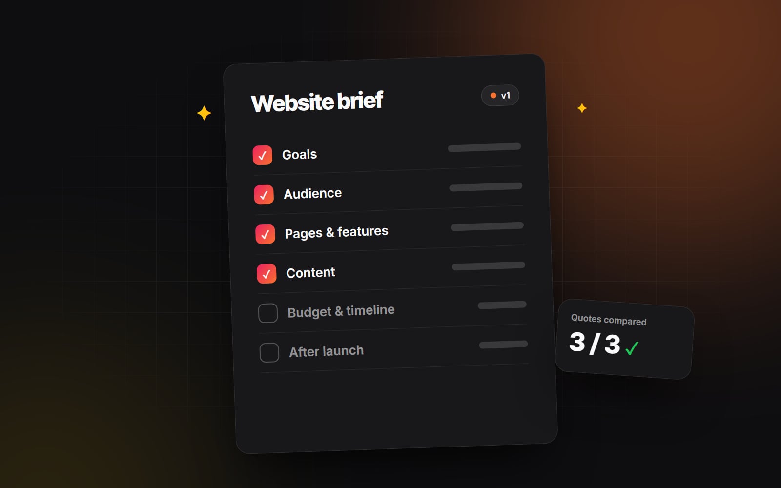
The quality of the handover has a large effect on the build. Before passing a Figma file to a Webflow developer, check that it includes:
- Colour and text styles defined in Figma, rather than colours and font sizes typed in by hand on each layer.
- Figma variables for colours, spacing and radii, if your team uses them.
- Components for repeated elements such as buttons, cards, navigation and footers, with variants for states like hover or active.
- Auto layout on most frames, which shows the developer how spacing and alignment should behave.
- At least two breakpoints: desktop and mobile. A tablet frame for complex sections helps too.
- Real or realistic content, including the longest headings and product names you expect, so layouts are tested against them.
- Notes on behaviour: what animates, what links where, what opens in a modal, and which parts come from the CMS.
If you are working on the design system itself, our guide to design systems that scale covers how tokens move from Figma into code.
Step 2: styles and variables in Webflow
The developer usually starts by setting up the site's foundations before building any page. In Webflow, that means:
- Variables for colours, sizes and fonts, created in the Variables panel. Changing a variable updates every element that uses it, which makes later brand changes much easier.
- Base tag styles for body text, headings, links and lists, so content in rich text fields looks right without extra classes.
- A class naming system that stays consistent across the site. Many developers use an established convention; what matters is that it is applied consistently.
- A style guide page inside the Webflow project that shows type, colours, buttons and spacing in one place. This becomes a reference for anyone working on the site later.
Typography is often where design and build drift apart. Font sizes that look right on a fixed desktop frame may need to scale fluidly between breakpoints. Our web typography guide explains fluid type scales and readability.
Step 3: components
Webflow components let a developer build an element once and reuse it across pages. Change the component and every instance updates. Component properties allow editors to change text, images, links or visibility on each instance without detaching it.
A thoughtful build mirrors the Figma components where it makes sense: navigation, footer, buttons, cards, call-to-action blocks and testimonial sections are common candidates. Not every Figma component needs to be a Webflow component, though. The developer should choose based on how the element will be reused and edited, not simply copy the Figma structure. Our Webflow components work follows this approach.
Step 4: responsive breakpoints
Webflow styles cascade from the base breakpoint, which is desktop by default, down to tablet, mobile landscape and mobile portrait. Styles set at a larger breakpoint apply to smaller ones unless they are overridden. Webflow also offers larger breakpoints above desktop for wide screens.
This affects how the developer works:
- Layouts are built with flexbox and grid so they adapt between breakpoints rather than relying on fixed widths.
- Overrides at smaller breakpoints are kept to what is needed, which keeps styles easier to maintain.
- Where the design only shows desktop and mobile, the developer has to decide how tablet behaves. Agree in advance whether they should check those decisions with the designer.
- Touch targets, menu behaviour and image cropping get particular attention on mobile.
If your designs started on desktop, our piece on mobile-first design explains why the mobile layout deserves equal attention.
Step 5: CMS templates and content
Any repeating content in the design, such as blog posts, case studies, team profiles or job listings, usually becomes a CMS collection. The developer builds one template page for each collection and binds its elements to fields. Collection lists display items on other pages, such as a grid of recent posts on the home page.
This is where the design and the content model meet. If a card in Figma shows a category, reading time and author photo, each of those needs a field or a reference in the CMS. Raise these details during handover rather than discovering them halfway through the build.
Step 6: interactions and custom code
Once the layout is stable, the developer adds interactions such as hover states, menus, tabs and scroll animations. These should follow the notes in the design file, and they should be restrained enough not to slow the page or distract readers. Custom code is added only where Webflow does not cover a need, for example a third-party widget, structured data or an integration script, and it should be documented.
Step 7: QA against the design
Quality assurance is where a careful build shows. A useful QA pass covers:
- 1 Comparing each page side by side with its Figma frame at desktop and mobile widths.
- 2 Resizing the browser slowly between breakpoints to catch layouts that break at in-between widths.
- 3 Testing on real phones and tablets, not only in browser emulation.
- 4 Adding very long and very short content to CMS items to check templates hold up.
- 5 Tabbing through every page with a keyboard to check focus order and visibility.
- 6 Checking colour contrast for text on coloured backgrounds and images.
- 7 Filling in and submitting every form.
- 8 Checking page titles, meta descriptions, Open Graph images and alt text in page settings and the Assets panel.
- 9 Running key pages through PageSpeed Insights.
Who does what in a Figma to Webflow project
| Stage | Designer | Webflow developer |
|---|---|---|
| Handover | Prepares styles, components, breakpoints and notes | Reviews the file and asks questions before building |
| Foundations | Confirms tokens and type scale | Sets up variables, base styles and class system |
| Build | Answers layout and behaviour questions | Builds pages, components and CMS templates |
| Responsive | Reviews tablet and in-between decisions | Builds and tests each breakpoint |
| QA | Reviews against the design | Fixes issues and checks accessibility and performance |
What to watch out for
- Pixel matching at the expense of flexibility. A site that matches Figma exactly at one width but breaks when content changes is not a good build.
- Designs with no mobile frames. The developer will have to guess, and the guesses may not match what you had in mind.
- Effects that are hard to build well on the web, such as heavy blur, complex masks or large video backgrounds. Discuss these early.
- Fonts without web licences. Check that the fonts in the design are licensed for web use before the build begins.
Web Canvas works from Figma to Webflow as part of our Figma to Webflow service, and we also offer UI/UX and brand design if the design itself still needs work. If you have a Figma file and want to talk about how it would translate to Webflow, get in touch.
Planning something similar?
Tell us what you're building and we'll come back with ideas and next steps.