Design systems that scale: from Figma tokens to production code.
How to structure design tokens, connect Figma to your codebase and keep a component library in use after launch.
Most growing websites reach the same point sooner or later. You look across your pages and find several slightly different primary buttons, a handful of modal implementations that behave differently, and two or three shades of the "same" brand blue hard-coded in different stylesheets. Designers say production doesn't match Figma; developers say Figma doesn't reflect how the layout actually has to work; new pages take longer than they should.
The usual response is to commission a big component library in Figma. It often looks immaculate at launch and then slowly drifts away from what is in production, because nothing connects the two.
Start with tokens, not components
A common mistake is designing cards, banners and modals before agreeing the underlying decisions they all share. A design token is a named design decision (a colour, a spacing step, a radius, a font size) stored in a platform-neutral format such as JSON, then compiled into whatever each platform needs: CSS custom properties, a Tailwind theme, or native app values.
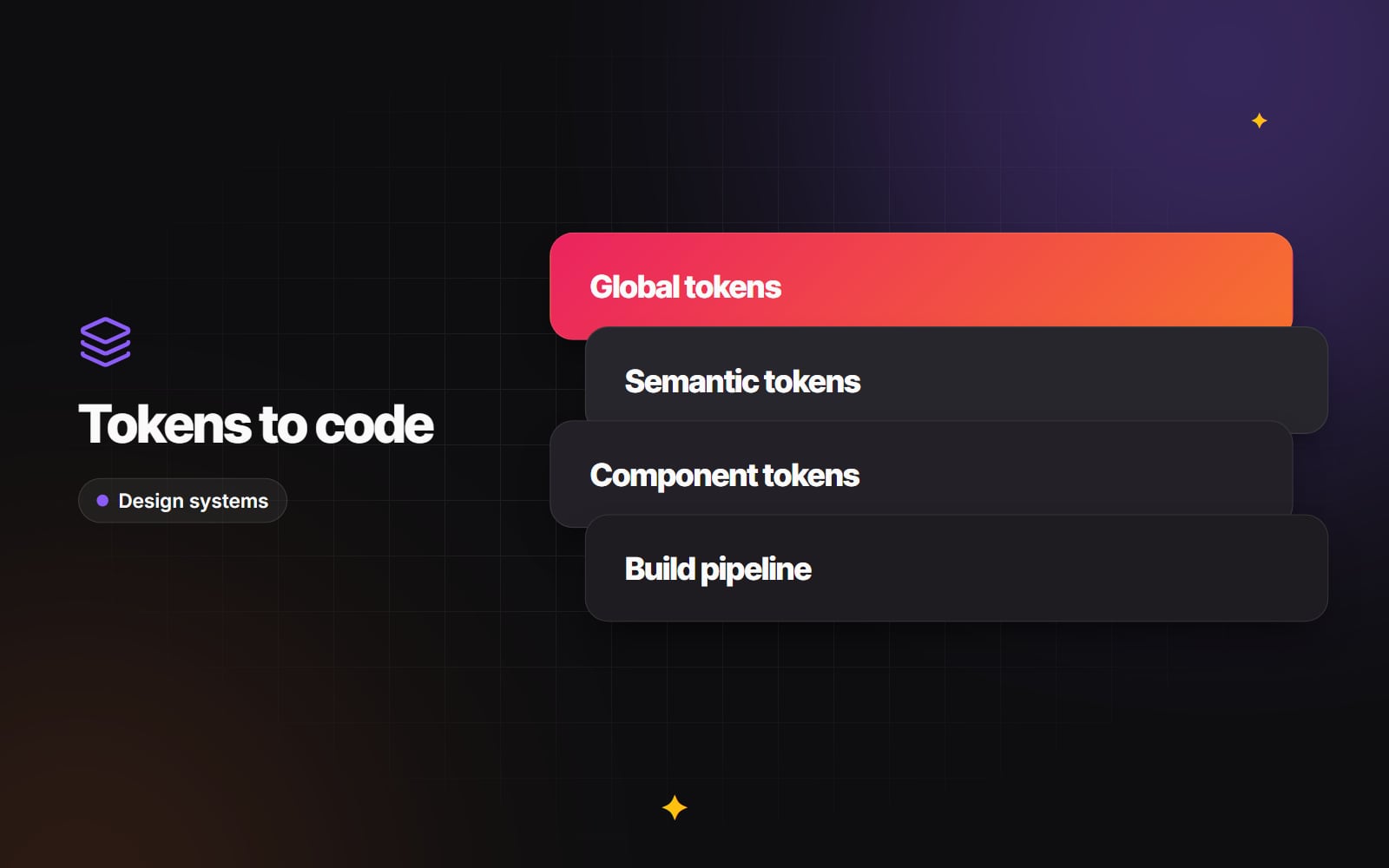
Most mature systems organise tokens in three tiers.
Tier 1: global (reference) tokens
These are raw values with no meaning attached. They describe your palette and spacing scale, nothing more:
-
color-blue-50: #EFF6FF,color-blue-500: #2563EB,color-blue-900: #1E3A8A -
space-1: 4px,space-2: 8px,space-4: 16px,space-8: 32px -
font-size-base: 16px,font-size-xl: 20px
Components should not reference these directly. If a button uses color-blue-500, you can no longer re-theme it without editing the button.
Tier 2: semantic (alias) tokens
Semantic tokens map raw values to a purpose. They say what something is for:
-
color-background-brand = {color-blue-500} -
color-surface-card = {color-neutral-0}in light mode,{color-neutral-900}in dark mode -
color-text-link-hover = {color-blue-600} -
color-border-danger = {color-red-500}
This is the tier that makes theming practical. To add a dark theme or a high-contrast theme, you remap semantic tokens to different raw values rather than rewriting component styles. Our guide to dark mode done properly shows how that plays out for surfaces and text.
Tier 3: component tokens
Component tokens bind semantic values to specific component properties:
-
button-primary-bg = {color-background-brand} -
button-padding-x = {space-4} -
button-radius = {radius-md}
With this separation in place, a change such as softening every button's corner radius becomes a one-line token edit and a rebuild, rather than a search through every stylesheet. Not every team needs Tier 3 on day one; small sites often manage well with global and semantic tokens only, adding component tokens where a component genuinely needs its own overrides.
Connect Figma to the codebase
When designers maintain components in Figma and developers re-type those values into code by hand, the two drift apart quickly. Someone nudges a padding value to fix a mobile layout, and the change never makes it back to the design file.
The fix is to give tokens one home and automate the route between tools. A typical pipeline looks like this:
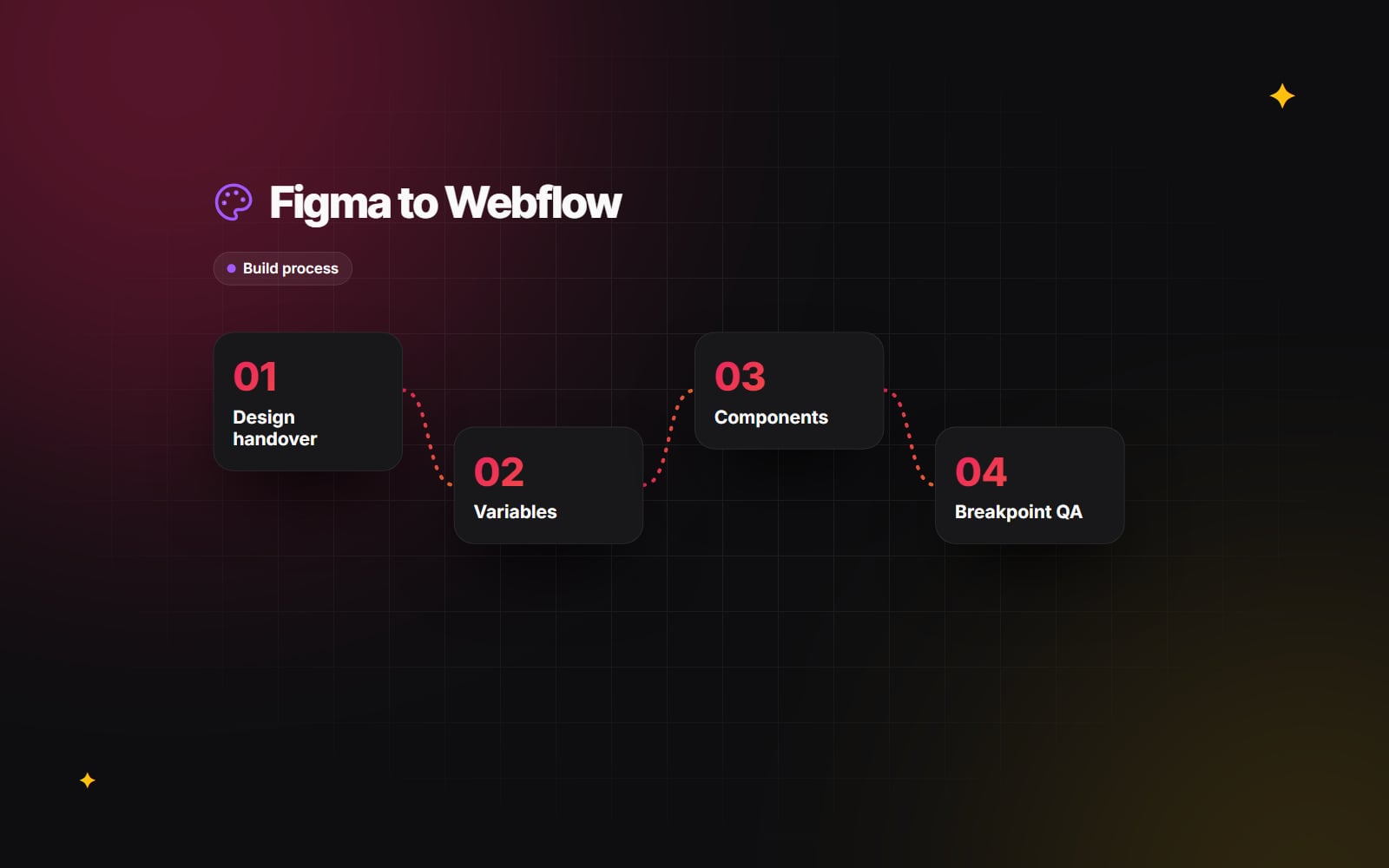
- 1 Define colours, spacing and type as Variables in your Figma library (or manage them with a plugin such as Tokens Studio).
- 2 Export the tokens as JSON to a Git repository, either through a plugin's sync feature or Figma's REST API. Check what your Figma plan allows, as API access to variables has been limited to certain plans.
- 3 Use an open-source build tool such as Style Dictionary to transform that JSON into CSS custom properties, a Tailwind theme, and TypeScript types.
-
4
Publish the output as a versioned package (for example
@yourcompany/tokens) or a shared folder in a monorepo. - 5 Import that package into each site or app, so a token change reaches production through a normal release, with a changelog and a version number.
The compiled CSS output is unremarkable, which is the point:
:root {
  --color-background-brand: #2563EB;
  --space-4: 16px;
  --button-radius: 8px;
}
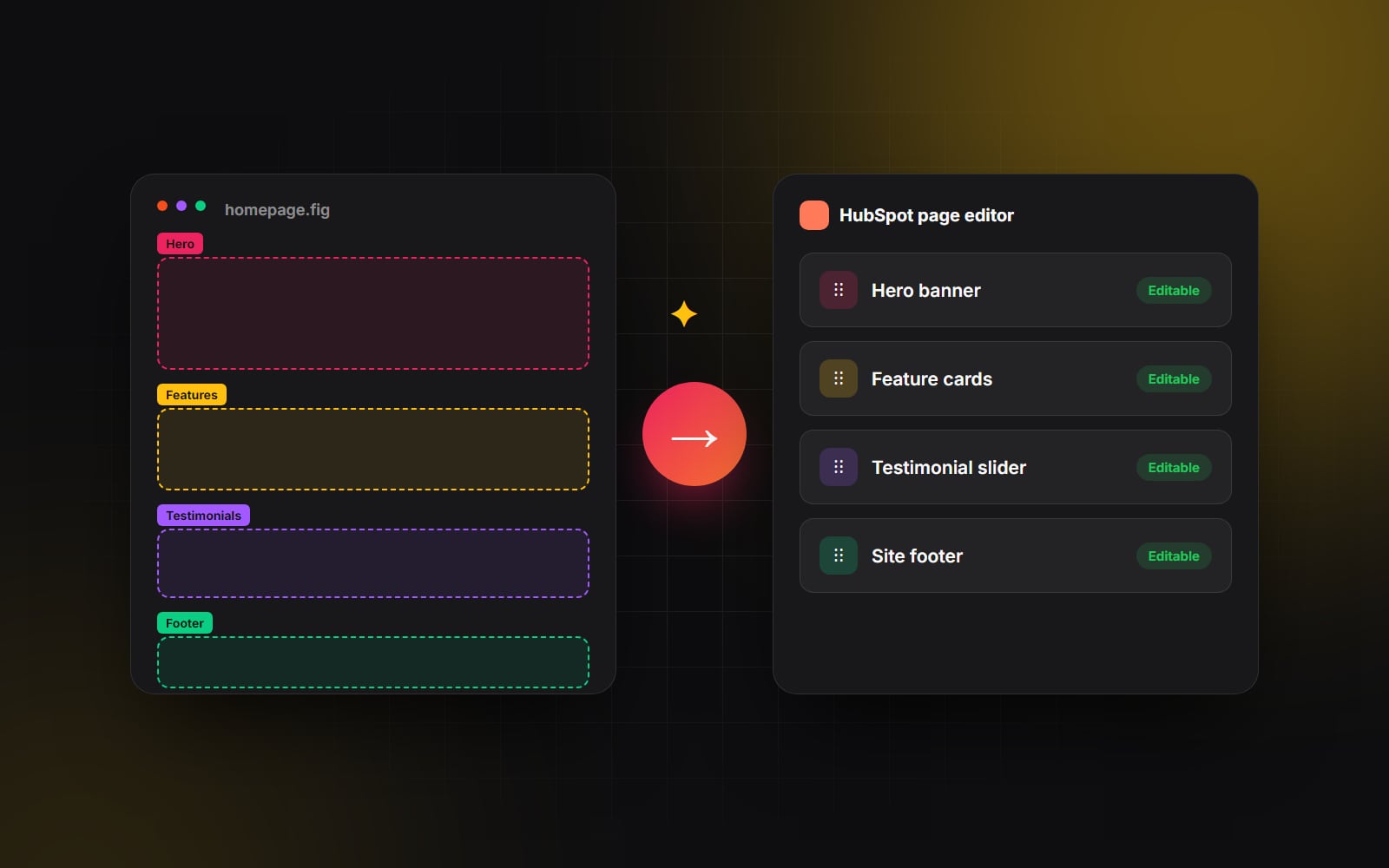
The same tokens can feed a CMS theme as well as a React app. On HubSpot, for example, they can drive theme fields and module styles; our article on moving from Figma to HubSpot covers the practical side. If you are weighing how tokens should surface in your stylesheets (utility classes, CSS Modules or plain custom properties), see our comparison of CSS architectures.
Make the system the easy option
Good intentions don't survive deadlines. When someone is shipping a fix late on a Friday, they will type a hex code unless something stops them. A few guardrails help:
-
Linting in pull requests. Configure Stylelint (and ESLint for CSS-in-JS) to flag raw hex values, arbitrary pixel values or unapproved utility classes. A rule that fails the build when someone writes
color: #2563EBinstead ofvar(--color-background-brand)does more than any style guide document. - A component catalogue. Tools such as Storybook give developers and designers one place to see every component and state. Pair it with visual regression tests so that unintended changes are caught; our guide to automated website testing explains the options.
- Responsive behaviour built in. Bake breakpoints and fluid type into tokens and components from the start, following a mobile-first approach, rather than patching desktop layouts later.
- Accessibility in the defaults. Check colour pairings in your semantic tokens against WCAG 2.2 contrast requirements (4.5:1 for normal body text) once, at the token level, so every component inherits a passing combination.
Govern change, don't freeze it
A design system that can't change will be bypassed. Agree a lightweight process early:
- 1 Anyone can propose a new component or variant, with the use case that needs it.
- 2 A named owner (or small group) decides whether it belongs in the system or stays local to one page.
- 3 Accepted changes are designed in Figma and built in code in the same piece of work.
-
4
Components being retired are marked as deprecated (for example with a TypeScript
@deprecatedcomment and a note in the catalogue) and given a replacement and a removal date. - 5 Removal happens on that date, in a version that is clearly flagged in the changelog.
The deprecation window depends on how many sites consume the system. One marketing site can move in a sprint; a group of products may need longer.
How to tell if it's working
You don't need invented productivity figures to judge a design system. Look for practical signs:
- New pages are assembled mostly from existing components, with few one-off styles.
- Linting rarely needs to be overridden.
- A brand change (a new accent colour, a different radius) can be made in tokens and released without a redesign.
- Designers and developers use the same names for the same things.
If those are true, the system is doing its job, whatever size it is.
Where to start
If your site already has inconsistent styles, begin with an inventory: list every colour, font size, spacing value and button variant actually in use, then collapse them into a short set of global and semantic tokens. Build the pipeline before building lots of components.
This is the kind of work our UI/UX and brand design team does alongside design system builds in Next.js. If you'd like a second opinion on where your own system is drifting, get in touch.
Planning something similar?
Tell us what you're building and we'll come back with ideas and next steps.