Tailwind, CSS Modules or plain CSS: choosing a CSS approach.
A practical comparison of Tailwind CSS, CSS Modules and modern plain CSS with layers and custom properties, and how to choose.
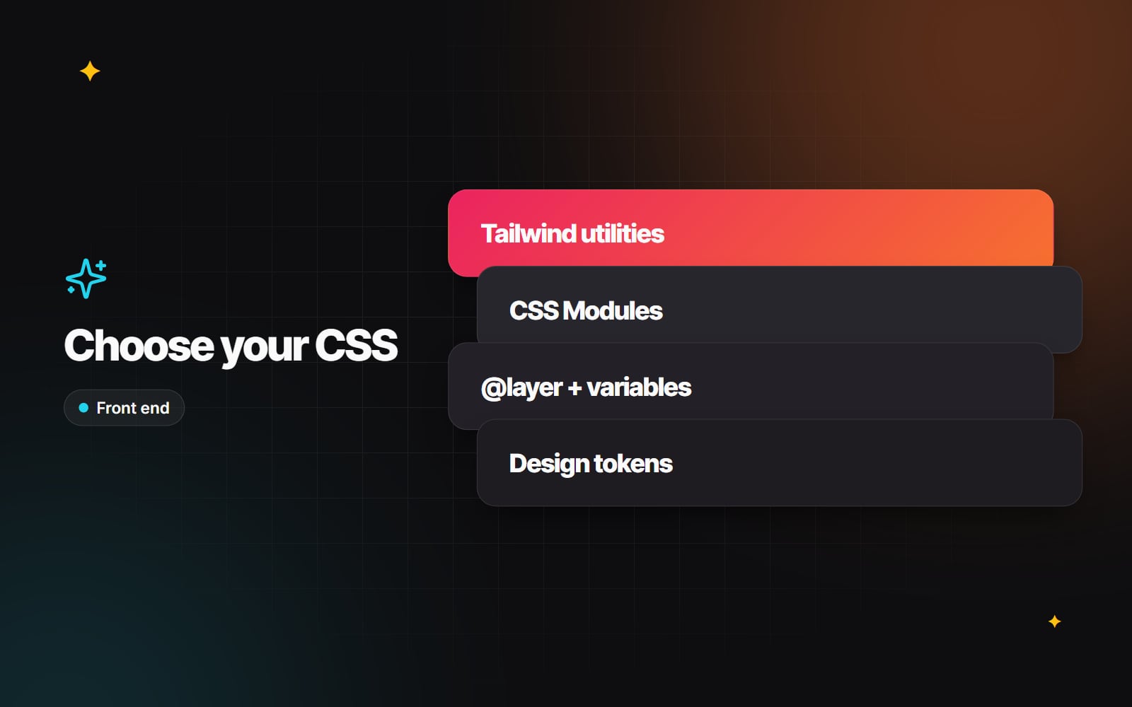
How a team writes CSS shapes how easy a site is to change a year after launch. Over the years there have been many approaches: naming conventions such as BEM, CSS-in-JS libraries, utility frameworks such as Tailwind CSS, and scoped CSS Modules. At the same time, browsers have gained features that used to need preprocessors or extra tooling.
This article compares three approaches we see most often on new builds: Tailwind CSS, CSS Modules and plain ("vanilla") CSS using modern browser features. None is right for every project. The aim is to help you pick the one that suits your team, platform and design system.
What modern CSS can now do on its own
Current versions of the major browsers support several features that change the comparison:
- Custom properties (variables) for colours, spacing and type sizes, which can change at runtime, for example for dark mode.
-
Native nesting, so you can write
.card { & h2 { … } }without Sass. -
Cascade layers (
@layer), which let you decide which groups of styles win, regardless of selector specificity. - Container queries, so a component can adapt to the space it is placed in, not just the viewport width.
-
Selectors and functions such as
:has()andcolor-mix().
If you need to support older browsers, check each feature on MDN or a compatibility table before relying on it.
Tailwind CSS
Tailwind provides small utility classes (flex, mt-4, text-lg) that you combine directly in your markup. Its build step scans your templates and generates only the classes you use.
Strengths
- The stylesheet stays small and stable. Because classes are generated from what is used, the CSS does not keep growing every time someone adds a page, and removing a component removes its styles.
- Design limits are built in. Spacing, colours and type sizes come from a defined scale, which helps keep a site consistent.
- Styles live with the component. In React, Vue or Blade templates, you change the look of a component in one file.
Trade-offs
- Markup gets long and harder to scan. Extracting repeated patterns into components helps.
- Long-form content from a CMS needs separate styling, usually through the official typography plugin or a small set of plain CSS rules.
-
Configuration changed in Tailwind v4: the theme is now defined in CSS with
@theme, while v3 projects usetailwind.config.js. Check which version a project is on before following a tutorial.
CSS Modules
CSS Modules let you write ordinary CSS in a file next to each component (for example Button.module.css). The build tool renames the classes so they are unique, which means styles in one component cannot clash with another. Next.js, Vite and most modern build tools support them without extra set-up.
Strengths
- Familiar syntax. Anyone who knows CSS can work on it straight away.
- Clean markup. Templates contain one or two class names rather than long utility strings.
- Works well with design tokens. Modules can use CSS custom properties generated from your design system tokens, which keeps them in step with Figma.
Trade-offs
- Total CSS grows with the number of components, and similar rules end up repeated across files unless the team agrees shared patterns.
- Nothing stops someone from typing an off-scale value, so design limits rely on code review and linting.
- They need a build step, so they are not a natural fit for traditional theme files.
Plain CSS with layers and custom properties
With nesting, layers and variables now built into browsers, plain CSS is a realistic choice again, especially where there is no JavaScript build pipeline.
Cascade layers in practice
Declare your layers once, in priority order. Styles in later layers beat styles in earlier layers, whatever the specificity:
@layer reset, base, components, utilities;

@layer components {
  .button { background: var(--colour-primary); }
}

@layer utilities {
  .bg-muted { background: var(--colour-muted); }
}
Here .bg-muted wins over .button because its layer comes later. Two details catch people out: styles that are not in any layer beat all layered styles, and !important reverses the layer order. Putting third-party CSS into an early layer is a tidy way to stop it overriding your own styles.
Strengths and trade-offs
- No build step needed, which suits WordPress block themes and Shopify themes.
- Standards-based, so it does not depend on a framework's future.
-
Scoping is your job. Without a naming convention or
@scope, styles can leak between components, so agree conventions early.
Comparison
| Question | Tailwind CSS | CSS Modules | Plain CSS |
|---|---|---|---|
| Where styles live | In the markup | A CSS file per component | Shared stylesheets |
| Scoping | Not needed (utilities) | Automatic | By convention, layers or @scope |
| Design limits | Built into the scale | Through tokens and review | Through tokens and review |
| Build step | Required | Required | Optional |
| Learning curve | Learn the class names | Low for CSS developers | Low, plus newer features |
| Typical fit | Component apps, marketing sites in Next.js or Laravel | Design system libraries, embedded widgets | WordPress and Shopify themes, simple sites |
How to choose
- 1 Start with the platform. If you are building a WordPress theme or a Shopify theme, plain CSS with layers and custom properties is usually the simplest fit.
- 2 For a component-based app, for example in Next.js, decide whether your team prefers styling in markup (Tailwind) or in separate files (CSS Modules).
- 3 Check what the team already knows. A familiar approach used consistently beats a better one used half-heartedly.
- 4 Put your design tokens (colours, spacing, type) in CSS custom properties whatever you choose, so they can be shared and themed.
- 5 Write the decision down, with a short example of how a new component should be styled.
Mixing is fine where there is a reason: many Tailwind projects use a small amount of plain CSS for CMS content, and CSS Modules projects often keep global tokens in a plain stylesheet.
Common traps
-
1
Escalating
!important. Once one rule uses it, others follow. Use layers or utilities to control priority instead. -
2
Arbitrary values everywhere. In Tailwind, frequent values like
mt-[19px]are a sign the design scale needs a token, or the design needs a conversation. - 3 Runtime CSS-in-JS in server-rendered React. Libraries that generate styles in the browser add JavaScript work and can be awkward with React Server Components. Prefer approaches that produce static CSS at build time.
- 4 Forgetting states in dark mode. Hover, focus and disabled states need to meet contrast requirements in both themes (WCAG 2.2 asks for 4.5:1 for normal text). See our dark mode guide.
- 5 Large refactors without visual checks. Use automated visual regression tests to catch unintended changes before they go live.
If you are planning a new front end or tidying up an existing one, our web development page explains how we work. Get in touch if you would like to talk through your project.
Planning something similar?
Tell us what you're building and we'll come back with ideas and next steps.