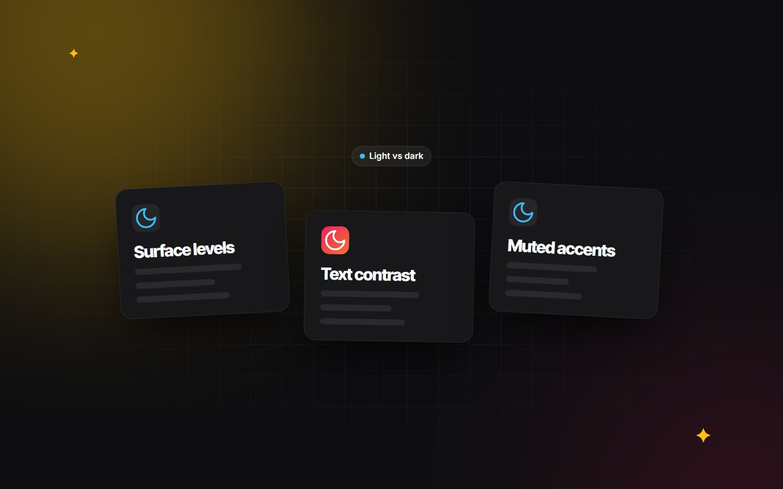
Dark mode done right: contrast, colour and brand consistency.
Choosing dark surfaces and text colours that pass WCAG, showing elevation without shadows, adapting brand colours and avoiding theme flashes.
Every major operating system now offers a system-wide dark appearance, and browsers pass that preference to websites. Many people leave it switched on, especially for evening use, so a site that ignores it can feel glaring. On phones with OLED screens, darker pixels also use less power, which is a small bonus for users.
A good dark theme is more than swapping white for black, though. Done carelessly, it produces harsh contrast, colours that seem to buzz against the background, invisible shadows and logos sitting in white boxes. This guide covers the decisions that make a dark theme comfortable, accessible and still recognisably on-brand.
1. Avoid pure black with pure white
White text on a pure black background gives the maximum possible contrast ratio of 21:1. That passes every accessibility test, but many readers find it uncomfortable for longer reading: bright text on true black can appear to glow or smear slightly, particularly for people with astigmatism. That's why most established dark themes use a very dark grey instead; Google's Material Design guidance, for instance, has long recommended a dark grey surface rather than black.
A softer base palette
-
Background: a deep charcoal or navy, such as
#0F172Aor#121212. -
Body text: off-white or light grey, such as
#E2E8F0. On#0F172Athat's roughly 14.5:1, comfortably above WCAG's 4.5:1 minimum for normal text. -
Secondary text: a muted grey, such as
#94A3B8, which is about 7:1 on#0F172A.
Be careful as surfaces get lighter. That same #94A3B8 placed on a raised surface of #334155 drops to about 4:1 and fails for body text. Check secondary text against every surface it can appear on, not just the page background. W3C's explanation of the contrast requirement sets out the thresholds, and our accessibility basics cover the rest.
2. Show elevation with lightness, not shadows
In a light theme, a card or modal floats above the page with a drop shadow. On a dark background, shadows barely show. Dark themes usually express depth by making raised surfaces slightly lighter:
| Level | Used for | Example colour |
|---|---|---|
| 0 – base | Page background | #0F172A |
| 1 – raised | Cards, panels, table containers | #1E293B |
| 2 – higher | Dropdowns, sticky bars, hover states | #334155 |
| 3 – top | Modals, dialogs, tooltips | #475569 plus a subtle light border |
A thin, low-opacity border (for example 1px solid rgba(255, 255, 255, 0.1)) helps the top layers separate from what's beneath without making them much lighter. The lighter a surface gets, the less contrast your text has against it, so re-check text colours on each level. Keep the number of levels small; three or four is usually enough.
3. Soften saturated accent colours
Brand colours chosen for a white background can look harsh on a dark one. Highly saturated reds, blues and purples may appear to vibrate against dark grey, and dark brand colours can disappear entirely.
- Adjust in HSL or OKLCH. Reduce saturation a little and raise lightness until the colour is comfortable and still clearly yours. There's no fixed percentage; judge it on screen and check contrast.
-
Use tinted backgrounds for status labels. Instead of solid dark green with white text, try a translucent tint with a lighter text colour, for example
background: rgba(34, 197, 94, 0.15); color: #4ADE80;. That text colour is about 10:1 on#0F172A. - Re-check buttons. A primary button that passed in light mode may not pass in dark mode, either for its text or for its outline against the page (WCAG asks for 3:1 for meaningful non-text elements such as input borders and focus indicators).
4. Treat images and logos deliberately
Bright photography can feel glaring inside a dark interface, and logos exported for white backgrounds often arrive with a white box around them.
-
Dim photos slightly. A gentle filter in dark mode takes the edge off:
img:not([src$=".svg"]) { filter: brightness(0.9); }. Don't apply it to product images where accurate colour matters to buyers. -
Use SVG for logos and icons. Inline SVGs with
fill="currentColor"pick up the text colour automatically, so they switch with the theme. -
Provide alternates when needed. For logos that can't simply change colour, use a
<picture>element with amedia="(prefers-color-scheme: dark)"source to serve a version designed for dark backgrounds.
5. Build it on tokens
The maintainable way to support two themes is semantic colour tokens: names like --color-surface, --color-text and --color-border that map to different raw values in each theme. Components only ever use the semantic names. Our guide to design systems that scale explains the token structure, and our CSS architecture comparison covers how this works with Tailwind or plain CSS.
:root {
  color-scheme: light dark;
  --color-surface: #FFFFFF;
  --color-text: #0F172A;
}

@media (prefers-color-scheme: dark) {
  :root {
    --color-surface: #0F172A;
    --color-text: #E2E8F0;
  }
}
Setting color-scheme also tells the browser to render built-in controls (form fields, scrollbars) in the matching style. Current browsers also support the CSS light-dark() function, which can shorten this further.
6. Respect the system setting, offer a toggle
Follow the user's operating system preference by default using the prefers-color-scheme media query, and let people override it with a toggle. To add a manual choice:
- 1 Add a toggle button with a clear accessible name, such as "Switch to dark theme".
-
2
When pressed, set an attribute on the root element, for example
data-theme="dark", and write your tokens so that attribute overrides the media query. -
3
Save the choice in
localStorage(wrapped in a try/catch, as storage can be unavailable). -
4
Add a small inline script in the
<head>that reads the saved choice and sets the attribute before the page paints, so there's no flash of the wrong theme. - 5 Offer a "System" option as well as light and dark, so people can go back to following their device.
In server-rendered frameworks such as Next.js, step 4 matters most, because the server doesn't know the visitor's preference. Because the script changes the <html> element before React hydrates, you'll typically need suppressHydrationWarning on that element.
Dark mode checklist
- No pure black background with pure white body text.
- Every text colour passes 4.5:1 (or 3:1 for large text) on every surface it appears on.
- Focus outlines and input borders are clearly visible.
- Raised surfaces are distinguishable without relying on shadows.
- Logos and icons adapt; photos aren't glaring; product colours are accurate.
- No flash of the wrong theme on load, and the toggle remembers the choice.
Typography matters just as much in a dark theme; see our web typography guide for line length and weight.
We build dual-theme interfaces as part of our UI/UX and brand design work. If you're planning a dark theme and want a second pair of eyes on the palette, get in touch.
Planning something similar?
Tell us what you're building and we'll come back with ideas and next steps.