Web typography: hierarchy, fluid type scales and readability.
Fluid headings with clamp(), comfortable line length and line height, WCAG contrast and font loading that doesn't shift the layout.
Most of what people do on a website is read. Headlines, product descriptions, prices, form labels and articles all depend on type, so typography decisions affect almost every page. Yet type is often treated as a final decorative step: pick two fonts, set a few pixel sizes at three breakpoints, and move on.
The result is familiar: awkward line breaks on phones, very long lines on wide monitors, grey text that's hard to read outdoors, and a visible jump when the web font finally loads. This guide covers the decisions that fix those problems: fluid sizing, line length, line height, contrast and font loading.
From fixed breakpoints to fluid type
The traditional approach sets a heading to one size on mobile, a larger size at a tablet breakpoint and another at desktop. It works, but it has some weaknesses:
- Sudden jumps. Text snaps between sizes as the viewport crosses a breakpoint, rather than scaling gradually.
- In-between screens. Devices come in a continuous range of widths, from small phones through foldables and tablets to large monitors. Fixed sizes chosen for three widths can look wrong at many others.
- Repetition. Setting size and line height for every heading level at every breakpoint adds a lot of CSS that is easy to get out of sync.
How clamp() works
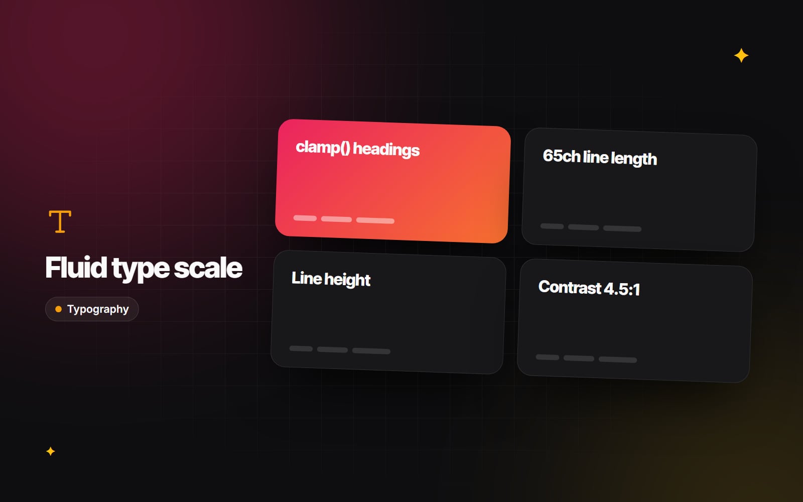
The CSS clamp() function takes a minimum, a preferred value and a maximum. The browser uses the preferred value but never goes below the minimum or above the maximum. It is supported in all current major browsers (MDN's reference has the details).
h1 {
  font-size: clamp(2.25rem, 1.5rem + 3vw, 4.5rem);
}
Assuming the default root size of 16px, this gives you:
- 36px (2.25rem) on viewports up to 400px wide, because the preferred value is smaller than the minimum there.
-
A smooth increase between 400px and 1,600px, as the
3vwpart grows with the viewport. - 72px (4.5rem) on viewports of 1,600px and wider, where the maximum takes over.
Two practical points:
-
Keep a rem part in the preferred value. A size made only of
vwdoesn't respond when someone zooms the page or increases their browser's default text size. WCAG asks that text can be resized to 200% without loss of content, so mixingremandvw(as above) keeps zoom working. - Body text barely needs to be fluid. Fluid sizing matters most for large headings. Body text usually works well at a steady 16–18px, perhaps nudging up slightly on large screens.
Fluid type pairs naturally with a mobile-first design approach: design the smallest size first, then decide how far it should grow.
Line length, line height and rhythm
Comfortable reading depends on a few variables working together.
Line length (measure)
A range of roughly 45–75 characters per line is a long-standing guideline in print and web typography. Very long lines make it hard for the eye to find the start of the next line; very short lines break sentences into choppy fragments. The ch unit makes this easy to set:
.article-body {
  max-width: 65ch;
}
Line height (leading)
One line height for everything rarely works. As text gets larger, it needs proportionally less leading:
| Text style | Typical line height | Why |
|---|---|---|
| Display and H1 headings | About 1.05–1.2 | Loose leading on large text makes a heading look like separate lines |
| Body text (16–18px) | About 1.5–1.7 | Gives the eye room to track from line to line |
| Captions and small print | About 1.4–1.6 | Small letterforms still need space to stay distinct |
These are starting points, not rules; fonts with tall x-heights often need a little more. WCAG also asks that layouts keep working if a user increases line height to 1.5 times the font size and adjusts letter and paragraph spacing, so avoid fixed-height containers that clip text.
Vertical rhythm
Use a consistent spacing scale for the gaps between headings, paragraphs and lists, ideally the same spacing tokens your components use. Give headings more space above than below, so each one clearly belongs to the content that follows it.
Contrast
Light grey text can look refined in a mockup and be hard to read on a cheap laptop or in sunlight. WCAG 2.2 at level AA requires a contrast ratio of at least 4.5:1 for normal text and 3:1 for large text (W3C explains the details in Understanding Contrast (Minimum)). For example, the popular slate grey #94A3B8 on white comes out at roughly 2.6:1, which fails for body text; a darker grey such as #64748B passes at roughly 4.8:1. Check every text and background pairing with a contrast checker, and see our accessibility basics for the wider picture. Dark themes need their own checks, covered in our dark mode guide.
Font loading without layout shift
While a web font downloads, the browser either hides text (a "flash of invisible text") or shows a fallback font and swaps it later (a "flash of unstyled text"). If the fallback and the web font have different proportions, the swap moves the layout, which counts towards Cumulative Layout Shift, one of Google's Core Web Vitals (a "good" CLS score is 0.1 or less).
To reduce both the delay and the shift:
- 1 Use WOFF2 files, which are widely supported and compress well.
- 2 Consider self-hosting fonts on your own domain, which removes the connection to a separate font server. Check the font's licence allows it.
- 3 Subset fonts to the character sets you actually use, so you are not shipping glyphs for languages your site doesn't publish in.
- 4 Preload only the one or two font files used above the fold.
-
5
Set
font-display: swap(oroptional) so text is visible straight away. -
6
Adjust the fallback font with the
size-adjust,ascent-override,descent-overrideandline-gap-overridedescriptors in@font-face, so it takes up almost the same space as the web font and the swap barely moves anything.
Our guide to font optimisation and zero layout shift walks through each step with code. Frameworks can do much of this for you: Next.js's next/font, for instance, self-hosts Google Fonts and generates adjusted fallbacks automatically.
A quick typography checklist
-
Headings use
clamp()with rem-based limits; body text is a steady, readable size. - Article and long-form text is limited to roughly 65ch.
- Line height decreases as size increases.
- Every text colour passes WCAG contrast against its background, in every theme.
- The page still works with browser zoom at 200% and increased text spacing.
- No more than a few font files load on a typical page, and the font swap causes no visible jump.
Typography is a large part of how a brand comes across, which is why we treat it as part of UI/UX and brand design rather than a finishing touch. If you'd like us to look over your site's type system, get in touch.
Planning something similar?
Tell us what you're building and we'll come back with ideas and next steps.