Web fonts without layout shift: self-hosting and preloading.
Self-hosting, WOFF2, subsetting, careful preloading and size-matched fallbacks to stop custom fonts delaying text or shifting layouts.
Custom fonts are a big part of how a brand looks on screen, but they are also a common cause of two problems: text that appears late, and text that jumps when the custom font replaces the fallback. That jump can push buttons and paragraphs around as someone is about to tap them, and it counts towards Cumulative Layout Shift (CLS), one of Google's Core Web Vitals. Google's "good" threshold for CLS is 0.1 or less.
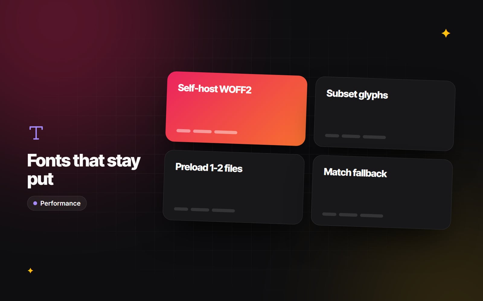
This guide covers why fonts cause these issues and the practical steps that fix them: self-hosting, using WOFF2, subsetting, preloading carefully, choosing the right font-display value and matching your fallback font's size to the real one.
Why fonts cause delays and layout shift
A browser cannot use a web font until it has found the @font-face rule in your CSS, decided the font is needed for text on the page, and downloaded the file. Until then it either hides the text (a "flash of invisible text") or shows a fallback font and swaps later (a "flash of unstyled text").
The swap is where layout shift comes from. Fonts differ in letter width, x-height and line height, so a heading set in Arial may wrap onto two lines while the same heading in your brand font fits on one. When the font arrives, everything below moves.
Third-party font services: what to consider
Linking to a hosted service such as Google Fonts is convenient, and it remains a reasonable choice for many sites. There are a few things to weigh up.
-
Extra connections. With Google Fonts, the browser fetches a stylesheet from
fonts.googleapis.comand then the font files fromfonts.gstatic.com. Each new origin needs its own connection before anything downloads, which adds time on slower mobile networks. - No shared cache benefit. Browsers now partition their caches by site, so a font downloaded on another website is not reused on yours. The old argument that a shared CDN font is "probably already cached" no longer holds.
- Privacy. Loading fonts from a third party sends the visitor's IP address to that provider. A German regional court ruled in 2022 that doing this without consent breached GDPR in that case. Self-hosting avoids the transfer altogether. Whether this affects you depends on your circumstances, so read our cookie consent and GDPR guide and confirm with a lawyer.
Five steps to stable, fast fonts
1. Self-host WOFF2 files
WOFF2 is a compressed font format supported by all current browsers, and it is usually noticeably smaller than TTF, OTF or the older WOFF. Unless you must support very old browsers, WOFF2 is the only format you need.
- 1 Check the font's licence allows web self-hosting. Most open-source fonts (including those on Google Fonts) do; commercial fonts vary.
- 2 Download the WOFF2 files for the weights and styles you actually use.
-
3
Place them in your site's static files folder (for example
/fonts/) so they are served from your own domain. - 4 Set long cache headers on the font files, and change the file name if you ever update a font.
2. Subset to the characters you need
A full font file can include many scripts and symbols you never use. Subsetting removes them, which can make the file much smaller. Tools such as pyftsubset (part of the open-source fontTools project) can do this. If your site is in English and other Western European languages, a Latin subset is usually enough. If you publish in other scripts, keep those ranges, and use unicode-range so each file is only downloaded when the page needs it.
3. Limit the number of weights
Every weight and style is a separate download. Two or three files (for example regular, bold and perhaps italic) are enough for most sites. A variable font can replace several static weights with one file, which is worth considering if you need many weights. This is also a design decision, covered in our typography guide.
4. Preload only what is needed early
Fonts are discovered late, because the browser has to read the CSS first. A preload hint tells it to start downloading straight away:
<link rel="preload" href="/fonts/brand-bold.woff2" as="font" type="font/woff2" crossorigin>- Preload only the one or two files used in text that appears immediately, such as the main heading and body text. Preloading everything competes with your CSS and hero image.
-
Always include
crossorigin, even for fonts on your own domain. Fonts are fetched in CORS mode, and without the attribute the preloaded file is not reused, so the browser downloads it twice.
5. Choose font-display and match the fallback size
font-display controls what happens while the font downloads:
-
swapshows fallback text immediately and swaps when the font arrives. Text is never hidden, but the swap can cause layout shift unless the fallback is size-matched. -
optionaluses the custom font only if it arrives very quickly; otherwise the fallback stays for that page view. This avoids shift entirely, at the cost of some visitors seeing the fallback.
To make swap stable, create an adjusted fallback using the size-adjust, ascent-override, descent-override and line-gap-override descriptors, so the fallback takes up the same space as your custom font:
@font-face {
  font-family: "Brand";
  src: url("/fonts/brand-regular.woff2") format("woff2");
  font-weight: 400;
  font-display: swap;
}

@font-face {
  font-family: "Brand Fallback";
  src: local("Arial");
  size-adjust: 105%;
  ascent-override: 92%;
  descent-override: 24%;
  line-gap-override: 0%;
}

body {
  font-family: "Brand", "Brand Fallback", sans-serif;
}
The percentages above are placeholders. The right values depend on your font and fallback, and open-source tools such as Fontaine or Capsize can calculate them from the font files. Browser support for the override descriptors varies, so check the current table on MDN; browsers that ignore them simply use the unadjusted fallback.
Next.js: let next/font do it
If your site is built with Next.js, the built-in next/font module handles most of this. For Google Fonts it downloads the files at build time and serves them from your own domain, so the browser makes no requests to Google. It also generates a size-adjusted fallback automatically. A minimal example:
// app/layout.tsx
import { Inter } from 'next/font/google';

const inter = Inter({ subsets: ['latin'], display: 'swap' });

export default function RootLayout({ children }: { children: React.ReactNode }) {
  return (
    <html lang="en" className={inter.className}>
      <body>{children}</body>
    </html>
  );
}
For your own font files, next/font/local works the same way. On WordPress, Shopify and similar platforms, the same principles apply but are set up in the theme; it is a regular part of WordPress speed work.
Common mistakes
- Preloading every weight. It delays more important files and rarely helps.
-
Leaving out
crossoriginon the preload. The font downloads twice. -
Assuming
swapfixes layout shift. It prevents invisible text, but without a size-matched fallback it can make shift worse. - Loading fonts twice. A theme, a plugin and a page builder can each add the same font. Check the network panel for duplicates.
- Testing only on a fast connection. Throttle the network in your browser's developer tools and reload, watching the headings and buttons above the fold.
How to check your result
- 1 Open the page in Chrome, then open DevTools and go to the Network tab.
- 2 Filter by Font and reload. Check how many files load, from which domains, and whether any appear twice.
- 3 Run a Lighthouse report and look at Cumulative Layout Shift and any font-related suggestions.
- 4 After launch, check real-visitor data in Search Console's Core Web Vitals report, which reflects how pages perform for actual users.
If your fonts are slowing pages down or shifting layouts and you would like a second pair of eyes, get in touch and tell us which platform your site runs on.
Planning something similar?
Tell us what you're building and we'll come back with ideas and next steps.