User journey mapping for service websites: fixing dead ends.
Plan for the different visitors to a service website, give every page a next step and use GA4 explorations to see where people stop.
A service business website is less a brochure than the first part of a sales conversation. People arriving on an agency, consultancy or B2B service site usually have specific questions: can this team solve my problem, have they done similar work, how do they work, roughly what will it cost, and how risky is it to switch?
If they have to dig through menus, decode vague service names or hit pages with no obvious next step, many will simply leave. User journey mapping is the practice of working out who visits, what each of them needs to know, and making sure every page offers a sensible next step.
Three visitor mindsets to plan for
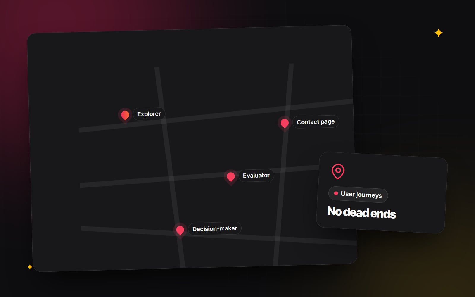
Your audience will vary, but most service sites see three broad mindsets. Map pages to each.
1. The problem-aware explorer
They know something is wrong ("our online shop's checkout feels slow", "our site fails Core Web Vitals") but not what the fix is. They need clear explanations and guides more than a sales pitch. Pushing them straight to "Book a consultation" usually comes too early.
Give them: helpful articles, plain-English explanations of the options, and a gentle route to the relevant service page.
2. The solution evaluator
They know what they need ("move our store from Magento to Shopify", "build a Next.js marketing site") and are comparing a few providers on technical depth, process, communication and reliability.
Give them: detailed service pages, a clear description of how you work, relevant case studies, and honest guidance on choosing between options, such as a platform comparison.
3. The decision-maker
Often a founder, marketing lead or finance lead who signs off the budget. They skim: headlines, who you've worked with, who's on the team, and signs that the project will be well run.
Give them: scannable summaries, real client work, clear information about process and team, and an easy way to start a conversation.
Remove dead ends
A dead end is any page that finishes without a sensible next step for the person reading it. They're easy to create and easy to fix. Each type of page needs its own kind of bridge:
- Case studies: end with a short summary of what was done, then two routes onward, such as a related service page and a related case study. For a case study about a HubSpot build, for example, the natural next step for a reader is the HubSpot service page, not the homepage.
- Service pages: explain the process and timeline, link to relevant guides and comparisons, and invite a brief. Our guide on writing a website brief is the kind of resource that helps people take that step.
- Blog posts: finish with links to the service the topic relates to and one or two related articles. A post about image formats, for instance, naturally leads to web development help with site speed.
- Thank-you pages: after a form, say what happens next and when, and offer something useful to read in the meantime.
Find where people actually stop, in GA4
Journey maps start as assumptions. Google Analytics 4's Explore section lets you test them. Our article on GA4 reports worth checking covers the standard reports; for journeys, use explorations.
Path exploration
- 1 In GA4, open Explore from the left-hand menu.
- 2 Choose the Path exploration template.
- 3 Click Start over (top right) to clear the default view.
- 4 Choose a starting point, such as Page title and screen name, and pick a key landing page (for example a main service page).
- 5 Expand the next steps to see where visitors go from there.
- 6 Look for patterns: if many people go from a service page back to the homepage rather than to contact or case studies, that page probably isn't answering their questions.
Funnel exploration
- 1 In Explore, choose the Funnel exploration template.
- 2 Edit the steps to match your journey, for example: viewed a service page, viewed the contact page, submitted the form.
-
3
Use page views or events (such as a
generate_leadevent fired on form submission) as conditions for each step. - 4 Review the drop-off between steps and break it down by device to see whether mobile visitors struggle more.
Scroll depth
GA4's enhanced measurement records a scroll event only when someone reaches about 90% of a page. If you want to know whether visitors reach a section halfway down, such as your case studies, set up additional scroll thresholds with Google Tag Manager. If few people reach your proof, move it higher.
Numbers tell you where people stop, not why. Pair them with a handful of real user sessions or short interviews with recent clients about how they chose you.
Offer steps that match readiness
Service decisions rarely happen in one visit. Offer different levels of commitment so people can take a step that suits where they are:
| Commitment | Example | Suits |
|---|---|---|
| Low | Read a guide, subscribe to a newsletter, download a checklist | Explorers |
| Medium | Send a short brief or project form | Evaluators |
| High | Book a call at a time that suits them | Decision-makers and ready evaluators |
Keep each form as short as it can be for its purpose. Our guide to form design people finish explains how.
A simple journey-mapping workshop
- 1 List your three to five most important visitor types and the question each most needs answered.
- 2 For each, write down the page they most often land on (from GA4 landing page data).
- 3 Walk that journey yourself, on a phone, and note every point where the next step isn't obvious.
- 4 Fix the dead ends first: add relevant next-step links and calls to action.
- 5 Set up a path exploration and a funnel exploration for each key journey.
- 6 Review them monthly and adjust the pages where people stop.
If you're planning a bigger change, start with a website audit before the redesign so you know which journeys work today.
Mapping and designing these journeys is part of our UI/UX design work. If you'd like a fresh look at where visitors get stuck on your site, get in touch.
Planning something similar?
Tell us what you're building and we'll come back with ideas and next steps.