How to wireframe a SaaS landing page: hero, proof and pricing.
A section-by-section structure for B2B SaaS landing pages: a clear hero, honest proof, problem-led features, pricing and an FAQ.
A buyer lands on a B2B SaaS landing page, reads a headline like "Empowering holistic synergy through next-generation cloud infrastructure", sees an abstract 3D shape, and leaves. They never found out what the product does, who it's for, roughly what it costs or why it beats what they already use.
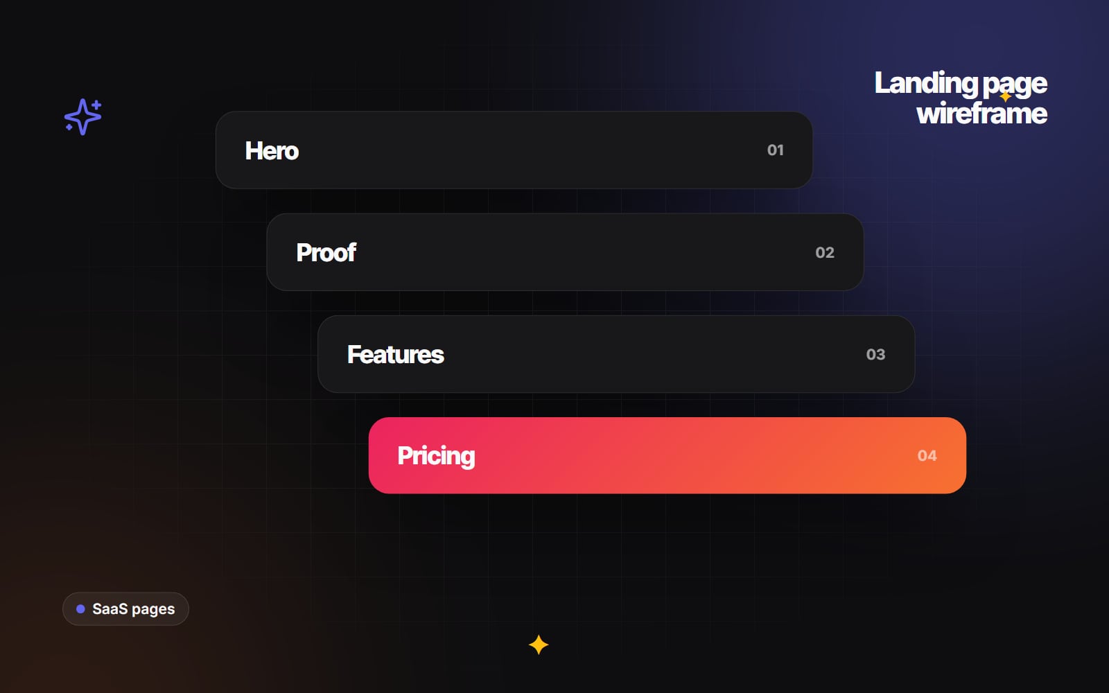
A good SaaS landing page is a structured argument. Each section answers the next question a sceptical buyer has, in the order they're likely to ask it, and points to one clear action. This article walks through that structure section by section, so you can wireframe it before anyone opens a design tool.
Section 1: the hero (clarity over cleverness)
Before scrolling, a visitor should be able to answer three questions: what is this, how does it help me, and what do I do next? Donald Miller's StoryBrand framework calls this the "grunt test", and it's a useful bar.
A practical hero has five parts:
- 1 An audience line. A short label above the headline saying who it's for, for example "For RevOps teams on HubSpot". It helps the right people recognise themselves quickly.
- 2 An outcome headline. A concrete statement of what changes, for example "Automate customer onboarding without engineering tickets". Plain verbs, no buzzwords.
- 3 A one- or two-sentence explanation. How it works, in everyday terms: "Connect your CRM to billing and new customers are set up automatically. No CSV exports."
- 4 One primary call to action, with reassurance. A single high-contrast button and a short line underneath that removes a worry, but only state what's true for your product: whether there's a free trial, whether a card is required, how setup works.
- 5 A real product view. A clear screenshot or short clip of the actual interface. Buyers want to see the product, not stock photos of people smiling at laptops.
A secondary link ("See how it works" or "View pricing") is fine, but keep it visually quieter than the main button.
Section 2: proof, early
Straight after the hero, before the feature detail, show why a buyer should believe you. Use only proof you have permission to use and can verify:
- Logos of customers who have agreed to be named, or of the platforms you integrate with (labelled as integrations, not customers).
- Real usage or reliability figures, if you publish them, with a source or date. If you don't have numbers you'd be comfortable defending, leave this out rather than inventing them.
- Security certifications and independent review badges that you actually hold, ideally linking to the report or listing.
A short, attributed quote from a named customer usually does more than a wall of logos.
Section 3: problem and solution feature blocks
Listing feature names ("Advanced webhook orchestration") makes the buyer do the translation. Instead, build each feature block around a problem they recognise:
- The problem: describe the current, painful way of working in the buyer's words, for example "Sales copies contact records between three tools every week, and duplicates creep in."
- The solution: explain what your product does about it, for example "Records sync between your CRM, billing and database as soon as a deal closes."
- The evidence: a screenshot of that feature, and if you have one, a genuine customer comment about it.
Alternating text and image left and right is a common layout for these blocks because it gives each one room. Three or four blocks covering your main jobs-to-be-done is usually enough; link to a features page for the rest.
Section 4: a short walkthrough
Many buyers want to understand a product before talking to sales. A tabbed component or a short, captioned video showing the setup flow answers "how hard is this to get going?". For example:
- 1 Connect your data source.
- 2 Choose the rules you want to automate.
- 3 Turn the workflow on and watch the first records sync.
If you use video, add captions, don't autoplay with sound, and make sure it doesn't delay the rest of the page loading. Any motion in tabs or toggles should follow the guidance in our article on micro-interactions.
Section 5: pricing
Whether to publish prices is a business decision, but buyers increasingly expect at least a sense of cost before they engage. If you can show pricing, wireframe it like this:
- Two to four plans, each with a short line about who it's for.
- Your recommended plan highlighted clearly, with a label saying why (for example "Best for growing teams") rather than a vague claim.
- A monthly/annual toggle if you offer annual billing, with the actual saving shown in the price itself.
- A comparison table of what differs between plans, kept below the plan cards so it doesn't overwhelm.
- For enterprise plans without a fixed price, say what affects the price and what a call involves.
Demo and sales forms on this page should be short. Our guide to forms people actually finish covers field choice and error handling. If your site runs on HubSpot, these forms and the follow-up can be handled natively; see our HubSpot landing page work.
Section 6: FAQ and a final call to action
End with an FAQ that answers the objections your sales team actually hears: how long migration takes, what happens if you exceed plan limits, where data is stored and how it's protected, and how cancellation works. Write the answers for buyers, not search engines; Google restricted FAQ rich results in 2023, so don't add an FAQ expecting extra search listings.
Then repeat the primary call to action, with the same reassurance as the hero, for visitors who have now read enough to act.
From wireframe to page
A sensible order of work:
- 1 Write the copy for every section in a document, using real customer language from sales calls and support tickets.
- 2 Build a greyscale wireframe of the six sections at mobile width first, then desktop.
- 3 Review it with someone from sales: does each section answer a question buyers really ask?
- 4 Design the page using your existing components and brand.
- 5 Build it, then check load speed and layout stability against Google's Core Web Vitals before launch.
- 6 Set up tracking for the primary call to action so you can see where visitors drop off.
Once the page is live, our article on B2B conversion rate optimisation explains how to test and improve it with real data rather than opinions.
If you're on HubSpot, our own SaaSFlow theme was built for SaaS marketing teams who want to put together pages like this without raising a developer ticket each time.
Our UI/UX design team can help wireframe and design a landing page around your product. If you'd like to talk it through, get in touch.
Planning something similar?
Tell us what you're building and we'll come back with ideas and next steps.