Custom HubSpot theme development, step by step.
The stages of a custom HubSpot theme build: discovery, Figma design, module library planning, building with the CLI, QA, training and launch.
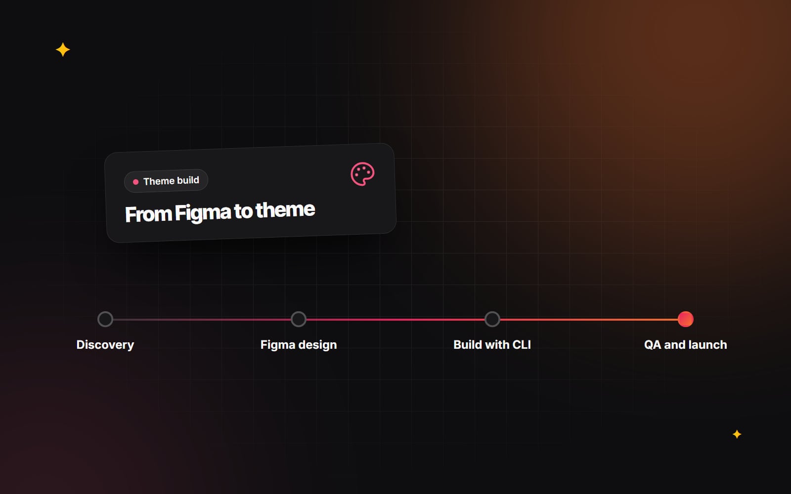
A custom HubSpot theme is more than a set of page designs turned into code. It is a system: templates, modules and theme settings that your marketing team will use to build pages long after the developers have moved on. This guide walks through each stage of HubSpot theme development, what happens in it, and what to check before moving to the next.
Custom theme or marketplace theme?
HubSpot's theme marketplace offers ready-made themes, and for some sites they are a sensible starting point. A custom theme makes more sense when your brand, content structure or editing needs do not fit a general-purpose theme, or when you want a module library built around your own page types rather than adapting someone else's. The process below assumes a custom build, though several stages apply to customising a marketplace theme too.
Stage 1: Discovery
Discovery establishes what the site needs to do and for whom. It usually covers:
- business goals and the main actions you want visitors to take;
- audiences and the journeys they follow, from first visit to enquiry;
- an inventory of existing pages, and which ones will be kept, merged or dropped;
- page types needed: home, service, case study, blog, landing page, resource, careers;
- who will edit the site and how often;
- CRM needs: forms, properties, lists, smart content and integrations;
- your Content Hub tier, since it affects features such as HubDB and memberships.
If you have an existing site, an audit at this stage saves rework later. Our guide on auditing your website before a redesign covers what to look at.
Stage 2: Design in Figma
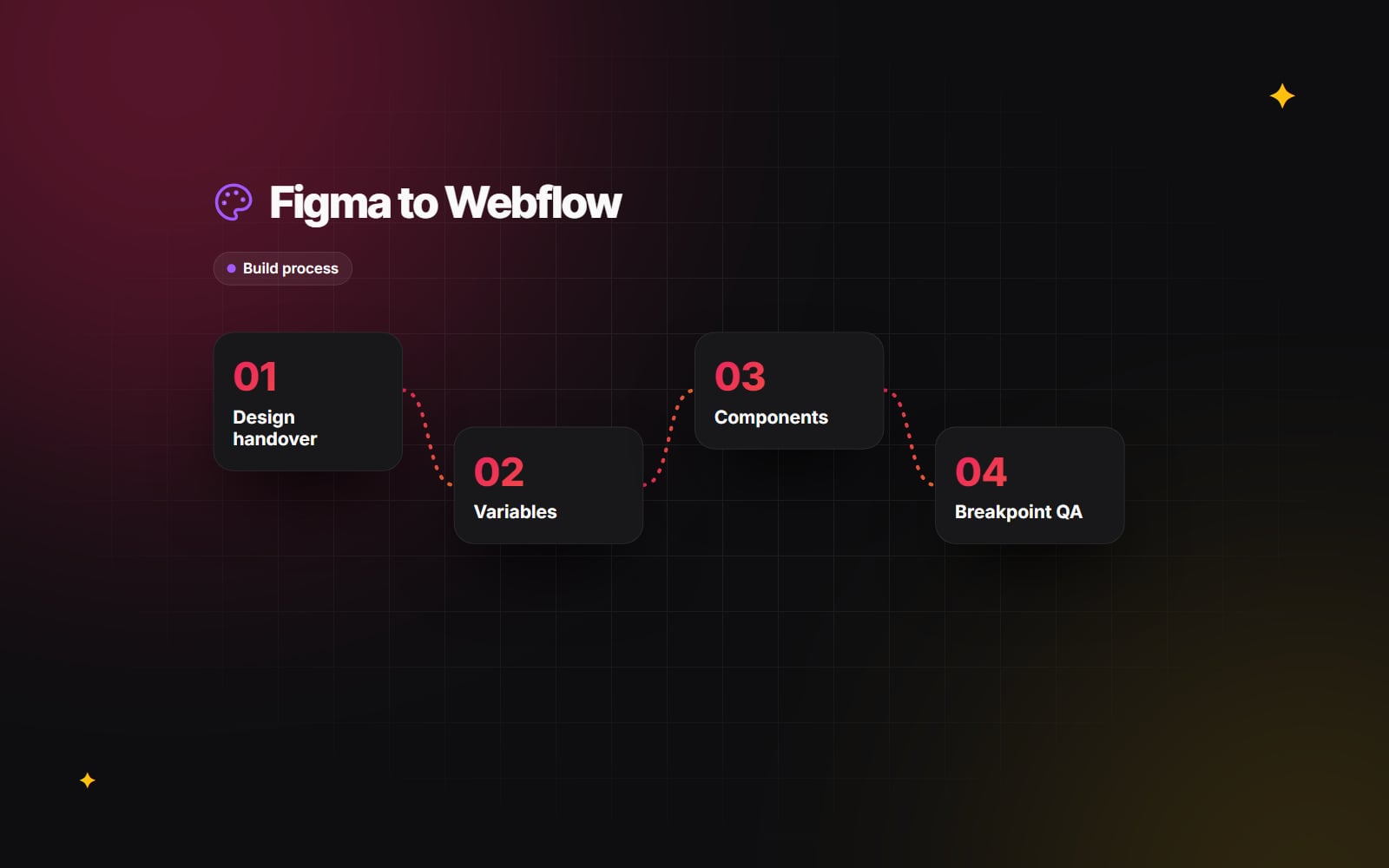
The design stage turns discovery into wireframes, then visual designs. For a HubSpot theme, the most useful approach is to design in components rather than whole pages. Each section of a page, such as a hero, a feature grid or a call-to-action band, becomes a Figma component with defined variants.
Good HubSpot-ready designs include:
- a type scale, colour palette and spacing system set up as styles or variables;
- desktop and mobile versions of every component;
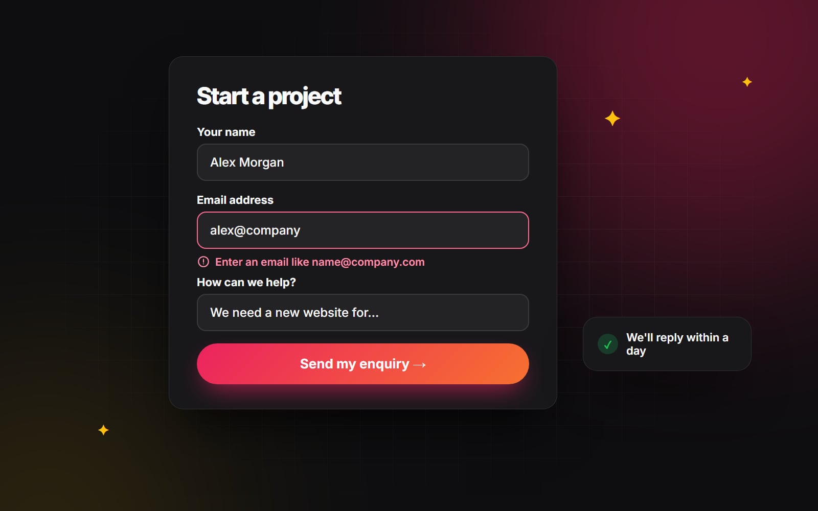
- states such as hover, focus, error and empty;
- realistic content lengths, including long headings and missing images;
- colour contrast that meets WCAG 2.2 AA for text and interface elements.
Designing this way makes the next stage much easier. We explain the thinking in design systems that scale and, for HubSpot specifically, in Figma to HubSpot: designing without platform limits.
Stage 3: Plan the module library
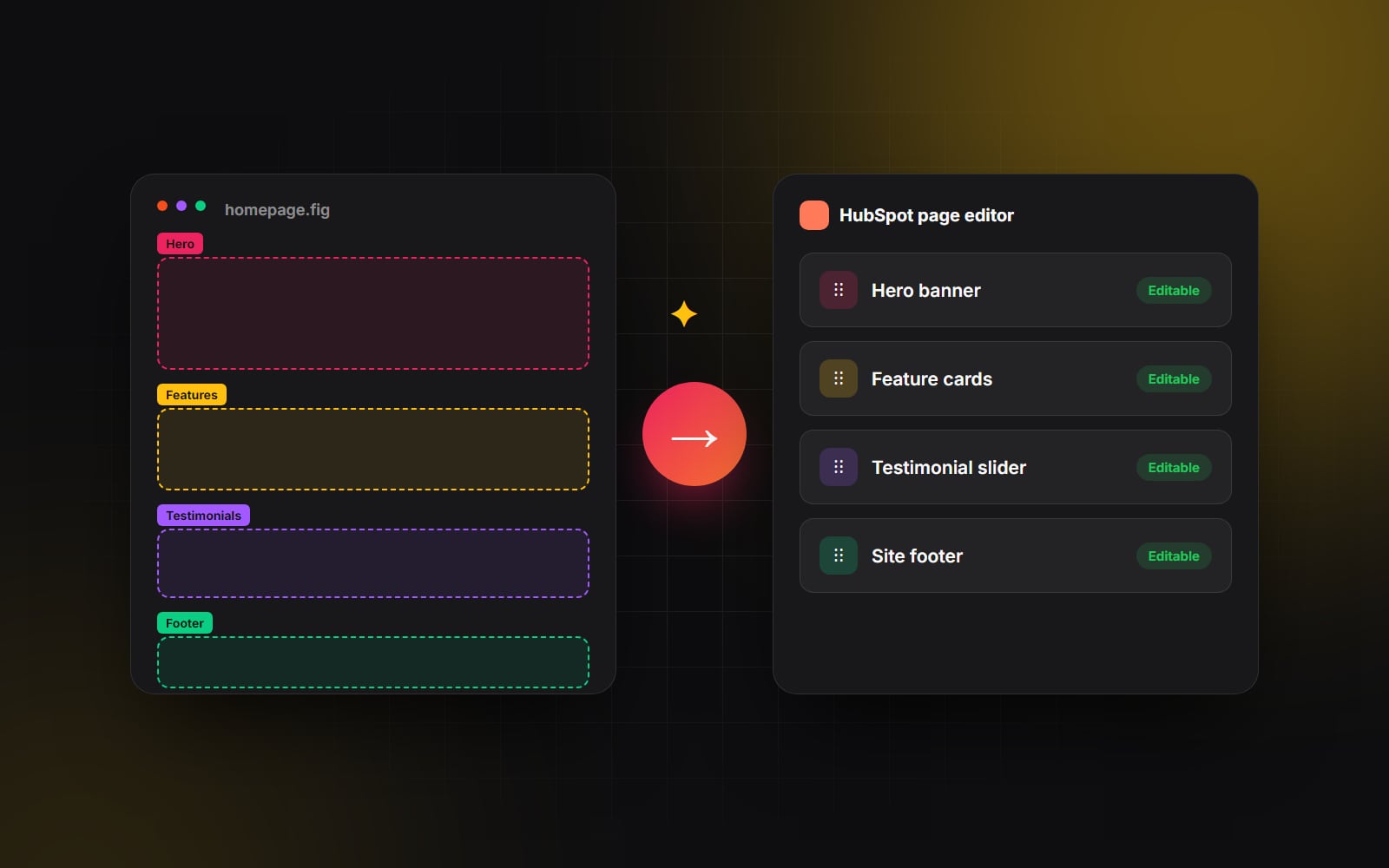
Before any code is written, map each Figma component to a HubSpot module, a theme setting or a template element. This is where a theme becomes easy or hard to use.
- Theme settings hold brand-wide choices: colours, fonts, button styles, spacing.
- Global partials hold the header, footer and other site-wide elements.
- Modules hold the sections editors place on pages.
- Templates set starting layouts for each page type, with drag-and-drop areas where flexibility is wanted.
For each module, write down its fields, which fields are optional, any repeater groups, and the variants it supports. Merge components that differ only slightly into one module with a style option. A short, well-designed module library is easier to learn than a long one.
Stage 4: Build with the HubSpot CLI
The build happens locally in a code editor, with the theme kept in a Git repository. The HubSpot CLI connects the local files to a HubSpot portal. A typical workflow looks like this:
hs init
hs create website-theme my-theme
hs watch my-theme my-theme
hs init authenticates the CLI with your portal, hs create website-theme starts from HubSpot's boilerplate, and hs watch uploads changes as you save. Most teams build in a sandbox or developer test portal first, then upload to the live portal when ready.
During the build, the developer:
-
sets up theme settings in
fields.jsonand connects them to the stylesheet; - builds each module with its fields, HubL markup, CSS and JavaScript;
- creates page, blog listing, blog post and system templates;
- styles HubSpot forms and adds accessible navigation;
- builds any HubDB tables, dynamic pages or membership templates in scope;
- keeps CSS and JavaScript light, and loads scripts only where modules need them.
HubSpot's developer documentation lists the current CLI commands and file formats, which are worth checking as they are updated from time to time.
Stage 5: Quality assurance
QA for a HubSpot theme has two sides: how pages look to visitors, and how the theme behaves for editors.
Visitor-facing checks
- Layout on common phone, tablet and desktop widths, and in major browsers.
- Keyboard navigation, visible focus, alt text and form labels. Our accessibility basics guide has a fuller list.
- Core Web Vitals: Google's thresholds for a good experience are LCP at or under 2.5 seconds, INP at or under 200 milliseconds and CLS at or under 0.1.
- Forms submitting to the right properties and triggering the right notifications.
- Meta titles, descriptions, canonical tags and social sharing images.
Editor-facing checks
- Every module dropped onto a blank page looks correct with default content.
- Long text, missing images and empty optional fields do not break layouts.
- Theme settings change colours and fonts across all modules.
- Field labels and help text make sense to someone who has not seen the design.
Stage 6: Training and handover
A theme is only as useful as the team's confidence in using it. Training usually covers building a page from a template, using each module, changing theme settings, publishing blog posts and setting up redirects. A recorded walkthrough and a short module guide help new team members later. Handover should also include access to the Git repository and notes on how to deploy changes.
Stage 7: Launch
For a new site replacing an old one, launch involves more than switching a domain. Redirects from old URLs, an updated sitemap, analytics and consent tools, and a check in Google Search Console all need attention. After launch, monitor forms, page speed and search coverage for a while before treating the project as finished.
Checklist: HubSpot theme development
- 1 Agree goals, audiences and page types in discovery.
- 2 Confirm your Content Hub tier and the features it includes.
- 3 Audit existing content and decide what moves across.
- 4 Design components, not just pages, in Figma.
- 5 Check colour contrast and mobile layouts in the designs.
- 6 Map each component to a module, theme setting, partial or template.
- 7 Set up a Git repository and a sandbox or test portal.
-
8
Build the theme locally and sync it with
hs watch. - 9 Test pages for layout, accessibility, speed and forms.
- 10 Test every module in the editor with default and edge-case content.
- 11 Train editors and share a module guide.
- 12 Upload redirects in Settings, under Domains & URLs, before switching the domain.
- 13 Launch, then monitor forms, speed and search coverage.
Web Canvas designs and builds custom HubSpot themes, with design work handled through our UI/UX and brand design service. If you are planning a new theme and want to talk it through, get in touch.
Planning something similar?
Tell us what you're building and we'll come back with ideas and next steps.