Checkout friction: 8 small problems that lose sales.
Eight common checkout problems, from surprise costs to forced accounts and slow mobile forms, with practical fixes and how to find yours.
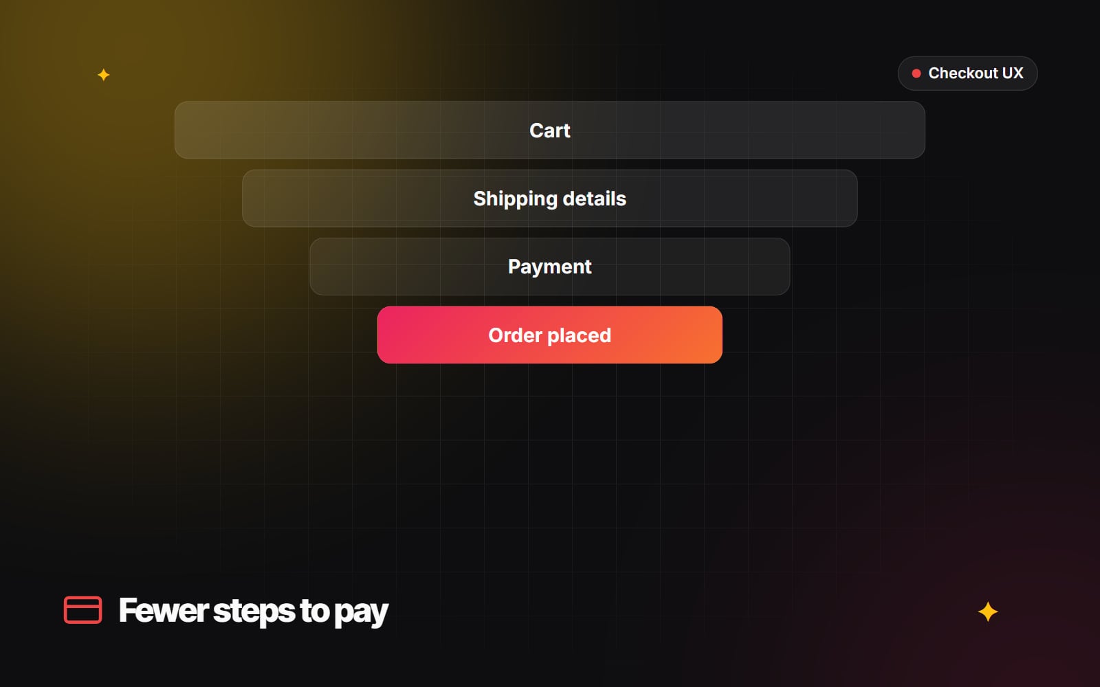
By the time a shopper reaches checkout, they've chosen a product, picked a size and decided to buy. Losing them now is expensive: you've already paid to bring them to the site. Large redesigns are rarely needed here. The usual culprits are small points of friction that make people hesitate, doubt or give up.
Baymard Institute, which has researched checkout usability for many years, consistently finds that unexpected extra costs such as shipping, taxes and fees are among the most common reasons people abandon a purchase. Many of the other reasons are just as fixable. Here are eight to check, with practical fixes for each.
1. Surprise costs at the last step
A shopper who sees one price on the product page and a noticeably higher one at payment feels misled, even if every charge is legitimate.
- State your shipping costs or thresholds clearly on product pages and in the cart.
- Show an estimated total, including shipping and taxes where you can, before the shopper starts checkout.
- If you offer free shipping above a set amount, show how far the cart is from the threshold. Make sure it's accurate.
2. Being forced to create an account
Asking a first-time buyer to invent a password and confirm an email address before they can pay adds work at the worst possible moment.
- Let people check out as guests.
- Offer account creation after the order is placed, on the confirmation page or in the confirmation email, using the details they've already entered.
- On Shopify, check your settings under Settings > Customer accounts to make sure accounts are optional at checkout.
3. Slow, error-prone address entry on mobile
Typing a full address on a phone keyboard is tedious and leads to typos that cause failed deliveries.
- Use address autocomplete, so selecting a suggestion fills in the street, town and postcode. Shopify's checkout includes address suggestions; on custom checkouts you'll need an address lookup service.
-
Use the right input types and
autocompleteattributes so browsers can fill in saved details. MDN's autocomplete attribute reference lists the values. - Ask only for fields you need, and label them clearly. Our guide to form design people actually finish covers the details.
4. No express payment options
Typing a card number, expiry date and security code on a phone is slow. Express wallets let returning shoppers pay with details they've already saved.
- Offer the wallets your customers actually use, such as Shop Pay, Apple Pay, Google Pay or PayPal, depending on your market and payment provider.
- Show express buttons near the start of checkout and, where it makes sense, in the cart.
- Test each wallet on real devices. A button that appears but fails is worse than no button.
5. Vague delivery times
"Standard shipping, 3–7 business days" makes the shopper work out the date. What they want to know is whether it will arrive in time.
- Where your carrier data is reliable, show an estimated delivery date or date range.
- State order cut-off times clearly if you offer next-day dispatch.
- Don't promise a date you can't keep. A missed estimate damages trust more than a cautious one.
6. Distractions during checkout
Full navigation menus, pop-ups and promotional banners give shoppers reasons to leave mid-purchase.
- Keep checkout focused: your logo, the order summary, the form and a way to get help.
- Turn off newsletter pop-ups and chat prompts on checkout pages.
- Shopify's checkout is already simplified. On custom-built checkouts, remove the main site navigation.
7. Not enough reassurance
Shoppers buying from a brand for the first time want to know their payment is safe and that they can return the item if it's wrong.
- Show the payment methods you accept, near the payment fields.
- Link to your returns and refund policy in plain words, and summarise it in one line, for example "Free returns within 30 days", but only if that is your actual policy.
- Make contact details or help easy to find.
- Don't add security badges or seals you aren't entitled to use. Shoppers increasingly recognise generic badges, and a fake seal is misleading.
8. A discount code box that sends people searching
A prominent empty "Discount code" field makes shoppers who don't have a code wonder whether they're missing out, and some leave to search for one.
- Where your platform allows it, make the field less prominent rather than removing it.
- For campaigns, use discount links that apply the code automatically. In Shopify, you can share a discount as a link from the discount's page in the admin.
- Consider automatic discounts for site-wide promotions, so nobody needs a code.
How to find out which ones matter for your store
Not every store has all eight problems. Use your data to decide where to start:
-
1
In GA4, build a funnel exploration from
view_carttobegin_checkouttoadd_shipping_infotoadd_payment_infotopurchase, if your store sends those events. - 2 Split the funnel by device category to see whether mobile drops off at a different step.
- 3 Watch session recordings of checkouts that didn't complete, if your tools and consent set-up allow it.
- 4 Place a test order yourself on a phone, over a mobile connection, as a new customer.
- 5 Fix the step with the largest drop first, then measure again after a few weeks.
Our guide to GA4 reports worth checking explains funnel explorations in more detail. Page speed matters at checkout too. See Core Web Vitals in plain English.
What you can change depends on your platform
On Shopify, checkout is customised through settings, the checkout editor and checkout extensions. Deeper changes to the information, shipping and payment steps need Shopify Plus. Our Shopify Plus vs Advanced guide explains the differences. On WooCommerce, Magento or custom platforms you have more control, and more responsibility for getting it right.
Checkout friction usually starts earlier, on the product page, so pair these fixes with a review of your product page. If you'd like an outside view, our e-commerce optimisation team can review your checkout. Get in touch to arrange it.
Planning something similar?
Tell us what you're building and we'll come back with ideas and next steps.