Product filters and faceted search: a UX guide for online stores.
How to design product filters shoppers can use: category-specific options, counts, OR/AND logic, mobile filter panels and SEO-safe filter URLs.
Picture a shopper who knows exactly what they want: a black, waterproof hiking boot in a size 10, under a certain budget. They land on a footwear collection with several hundred products. If the only way to narrow that list is to scroll page after page of thumbnails, or if every tick of a filter reloads the whole page and throws them back to the top, many will give up and look elsewhere.
Filters and faceted search are how shoppers turn a large catalogue into a short list. This guide covers the design decisions that make filtering feel effortless, the logic shoppers expect, how to handle mobile, and how to stop filter URLs causing problems in search.
Filters vs faceted search: a quick definition
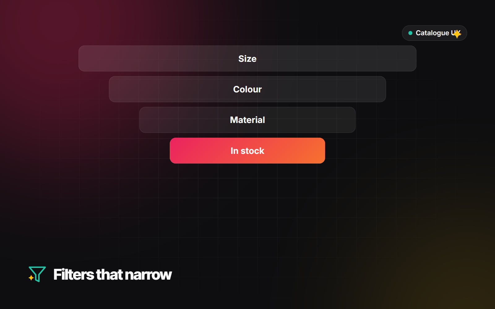
People use the terms loosely. A filter narrows a list by one attribute, such as price. Faceted search lets shoppers combine several attributes at once (size, colour, material, availability) and shows how many products match each option as they go. Most modern stores offer the second, even if the interface just says "Filter".
1. Update results without a full page reload
A full reload after each tick flashes a blank screen, resets the scroll position and makes the shopper wait before they can choose the next option. Better practice is to fetch the new results in the background and swap only the product grid.
- Keep the shopper's scroll position, or move them gently to the top of the grid rather than the top of the page.
- Show a light loading state on the grid so it's clear something is happening.
- Update the address bar as filters change (using the browser's history.pushState() or replaceState()), for example /collections/boots?size=10&colour=black. That way a filtered view can be bookmarked or shared, and the Back button returns to the previous selection instead of leaving the page.
- Announce the new result count to screen-reader users, for example with a polite live region ("18 products"). Our accessibility basics guide covers why this matters.
On Shopify, themes built on the current Online Store 2.0 architecture generally support filtering through the storefront without custom code, and many already do this background update. If your theme reloads the page, that is usually a theme change rather than a platform limitation.
2. Use filters that fit each category
A single sidebar of the same filters on every collection is easy to build but rarely helpful. The attributes that matter depend on what someone is buying:
| Category | Filters shoppers typically look for |
|---|---|
| Clothing | Size, fit, colour, material, occasion |
| Electronics | Compatibility, connectivity, storage, battery life |
| Furniture and homeware | Dimensions, room, finish, assembly required |
| Food and groceries | Dietary needs, pack size, origin |
The hard part is usually data, not design. A filter can only work if every product carries that attribute in a consistent format. "Navy", "navy blue" and "Dark blue" will appear as three separate options unless someone cleans them up. On Shopify, structured attributes like material or fit are best stored as Shopify metafields, which the Search & Discovery app can turn into filters. Shopify's help centre explains which product data can be used as filters.
Before adding filters, look at what shoppers actually search for on your site and what customer service is asked most often. Those are your strongest filter candidates.
3. Show counts and avoid dead ends
Few things are more frustrating than choosing three reasonable options and getting "No products found". Two habits prevent most of these dead ends:
- 1 Show a count next to each option, such as "Black (24)", and update the counts as other filters are applied.
- 2 Handle options that would return nothing. Either hide them or show them dimmed and unselectable. Dimming keeps the layout stable and tells the shopper the option exists in other combinations; make sure dimmed options still have enough contrast to read and are marked as unavailable for assistive technology.
If a shopper does reach zero results, give them a way out: show which filters are active, offer a one-tap "Clear all", and suggest removing the most restrictive filter.
4. OR within a group, AND between groups
Filtering logic should match what people expect without thinking about it:
- Within one group, use OR. Ticking "Blue" and "Navy" should show products that are blue or navy. Using AND here would usually return nothing, because a single product is rarely listed as both.
- Between groups, use AND. Choosing "Size 10" and "Waterproof" should show products that are both.
Also show the active filters as removable chips above the grid. It makes the current selection obvious and lets shoppers undo one choice without reopening the filter panel.
5. Design filtering for mobile first
A large share of shopping happens on phones, where a desktop-style sidebar simply doesn't fit. Following mobile-first design principles, a common and effective pattern is:
- 1 Place a clear "Filter and sort" button near the top of the collection, and keep it reachable (for example, sticky) as the shopper scrolls.
- 2 Open a full-height panel or bottom sheet with each filter group as a collapsible section.
- 3 Make each option easy to tap. WCAG 2.2 sets a minimum target size of 24 by 24 CSS pixels, and larger targets are more comfortable on touch screens.
- 4 Put a fixed button at the bottom of the panel that shows the live result, such as "Show 18 products", so shoppers know what they'll get before closing it.
- 5 Keep "Clear all" visible inside the panel.
6. Sorting, search and filters work together
Filtering doesn't replace site search or sorting. Shoppers who type a query expect to filter the results too, and "Price: low to high" or "Newest" is often the next step after filtering. If your search struggles with synonyms and misspellings, our guide to semantic search looks at the options.
Faceted navigation and SEO
Every combination of filters can create a new URL. With many attributes, that becomes a very large number of near-duplicate pages, and search engines can spend time crawling them instead of your important pages. Google has published guidance on managing crawling of faceted navigation URLs, and the main options are:
- Canonical tags. Filtered pages can point a canonical tag at the main collection URL, signalling which version you want indexed. Canonicals are a hint, not a command, but they usually help.
- Blocking crawling. Rules in robots.txt can stop crawlers requesting filter parameters at all. Be careful combining this with canonicals: if a URL is blocked, crawlers can't see its canonical tag. Check what your platform already does before adding rules.
- Dedicated landing pages for valuable combinations. If people genuinely search for something like "men's black leather boots", a proper collection page with its own copy is usually better than relying on a filtered URL.
Use Google Search Console to check whether filtered URLs are being crawled or indexed, and include faceted URLs in any technical SEO audit.
A quick checklist
- 1 List the filters shoppers need for each main category.
- 2 Clean up product data so each attribute uses consistent values.
- 3 Make results update without a full reload, with filters reflected in the URL.
- 4 Add counts and handle zero-result options.
- 5 Check OR/AND logic with real combinations.
- 6 Test the mobile panel on a real phone, one-handed.
- 7 Decide which filtered URLs search engines should crawl and index.
Good filtering is a mix of tidy product data, sensible logic and careful interface design. If you'd like help with filters on a Shopify store, see our Shopify theme customisation and e-commerce optimisation work, or get in touch to talk through your catalogue.
Planning something similar?
Tell us what you're building and we'll come back with ideas and next steps.